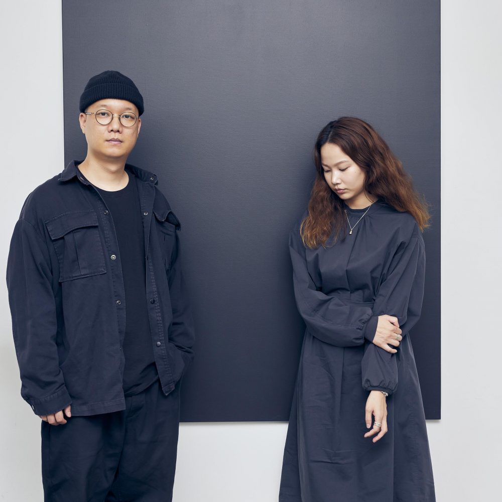
ABOUT

Intro

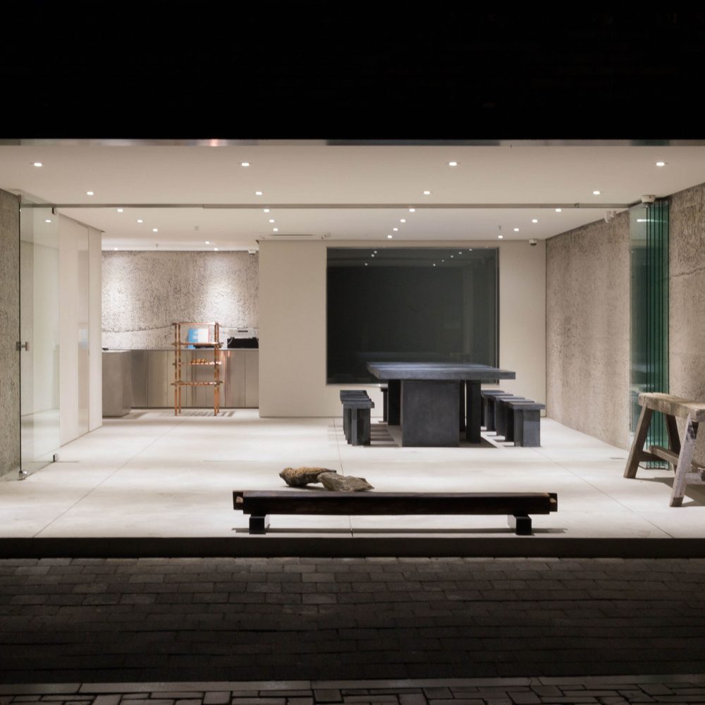
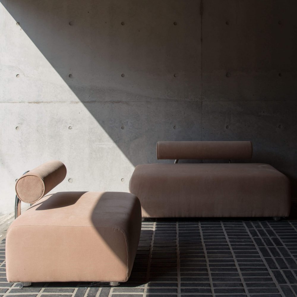
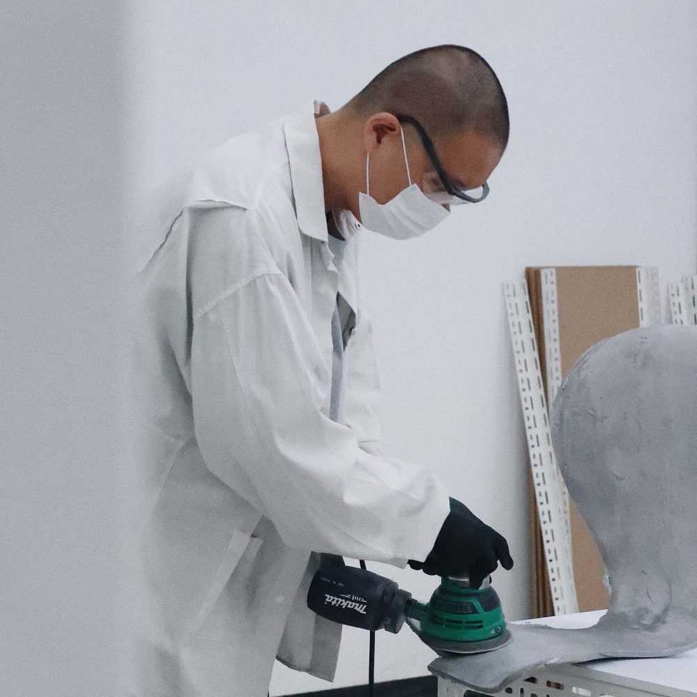
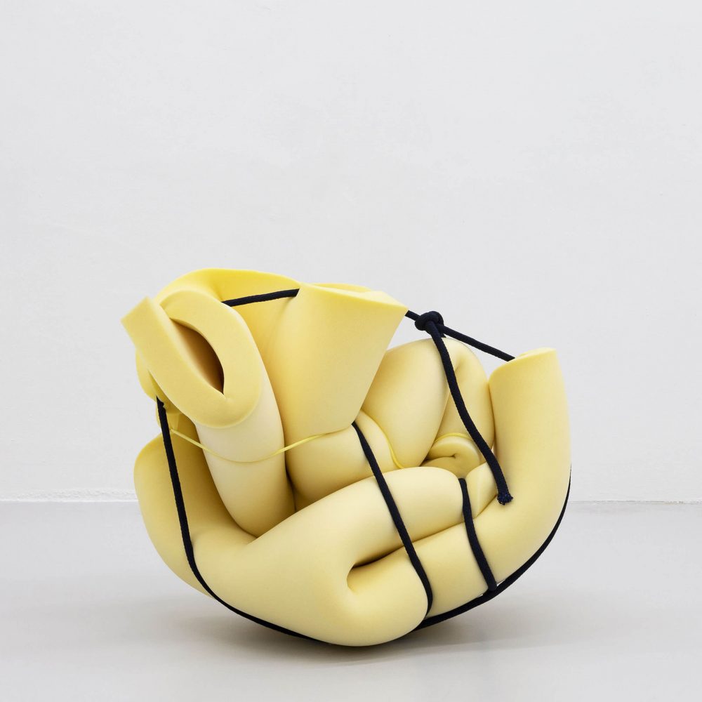
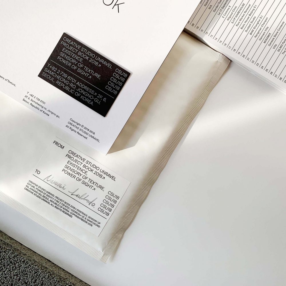
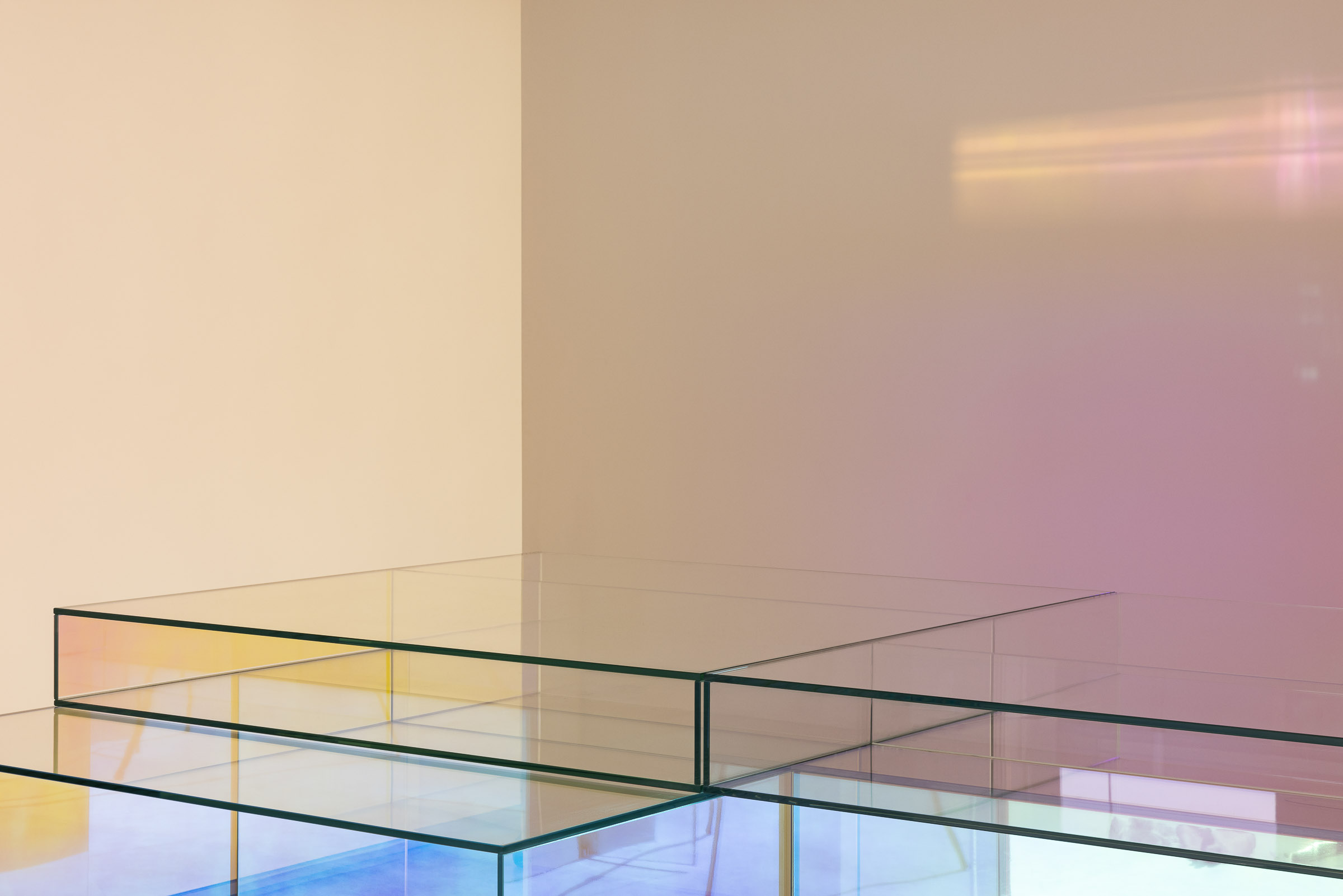
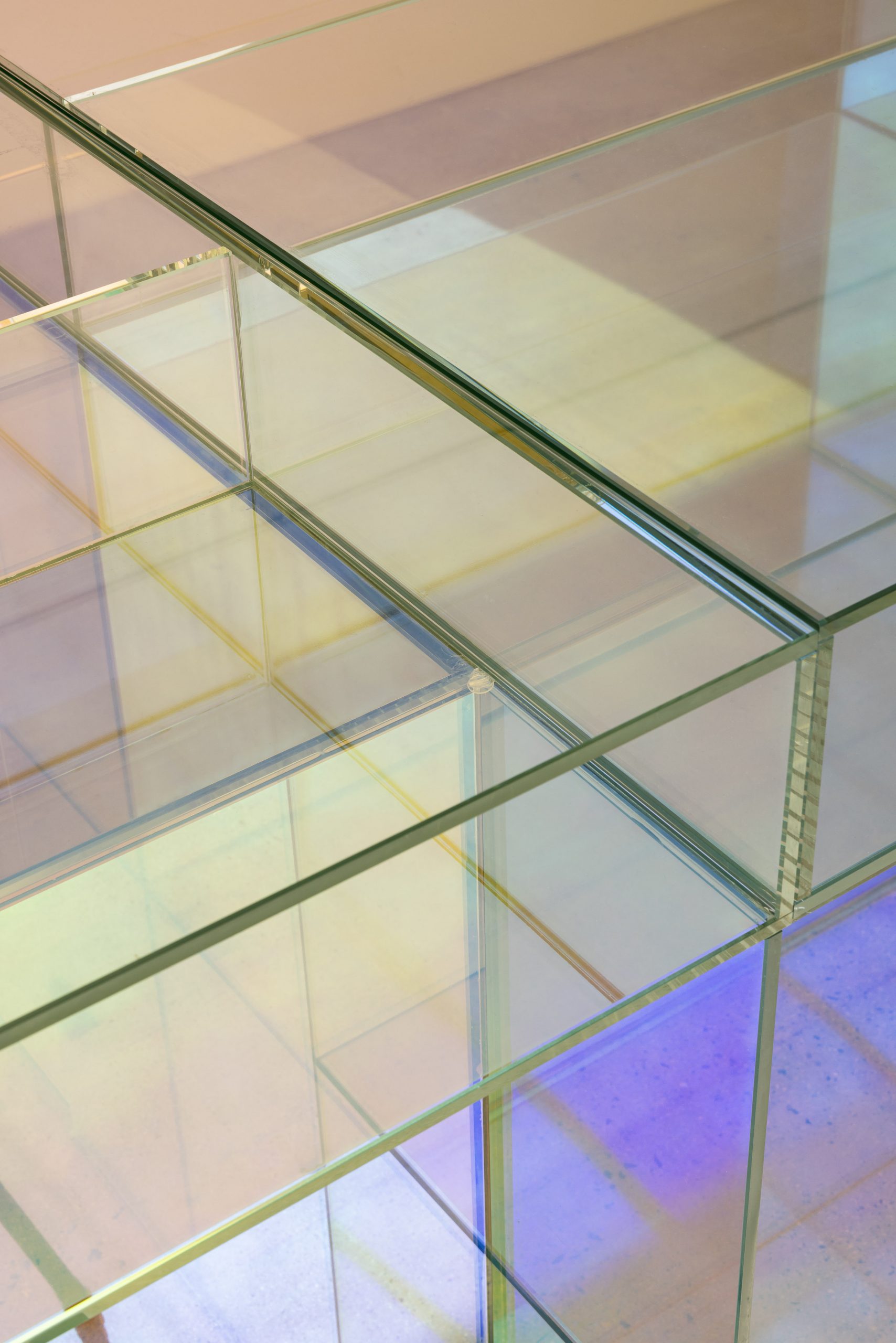
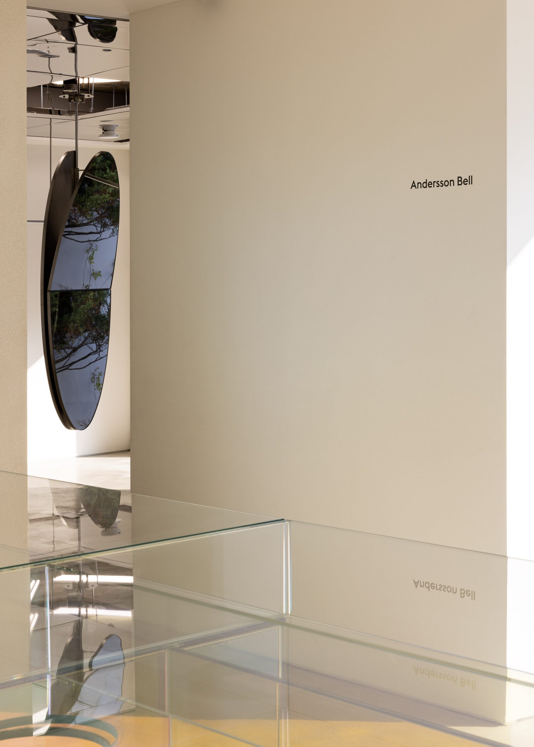
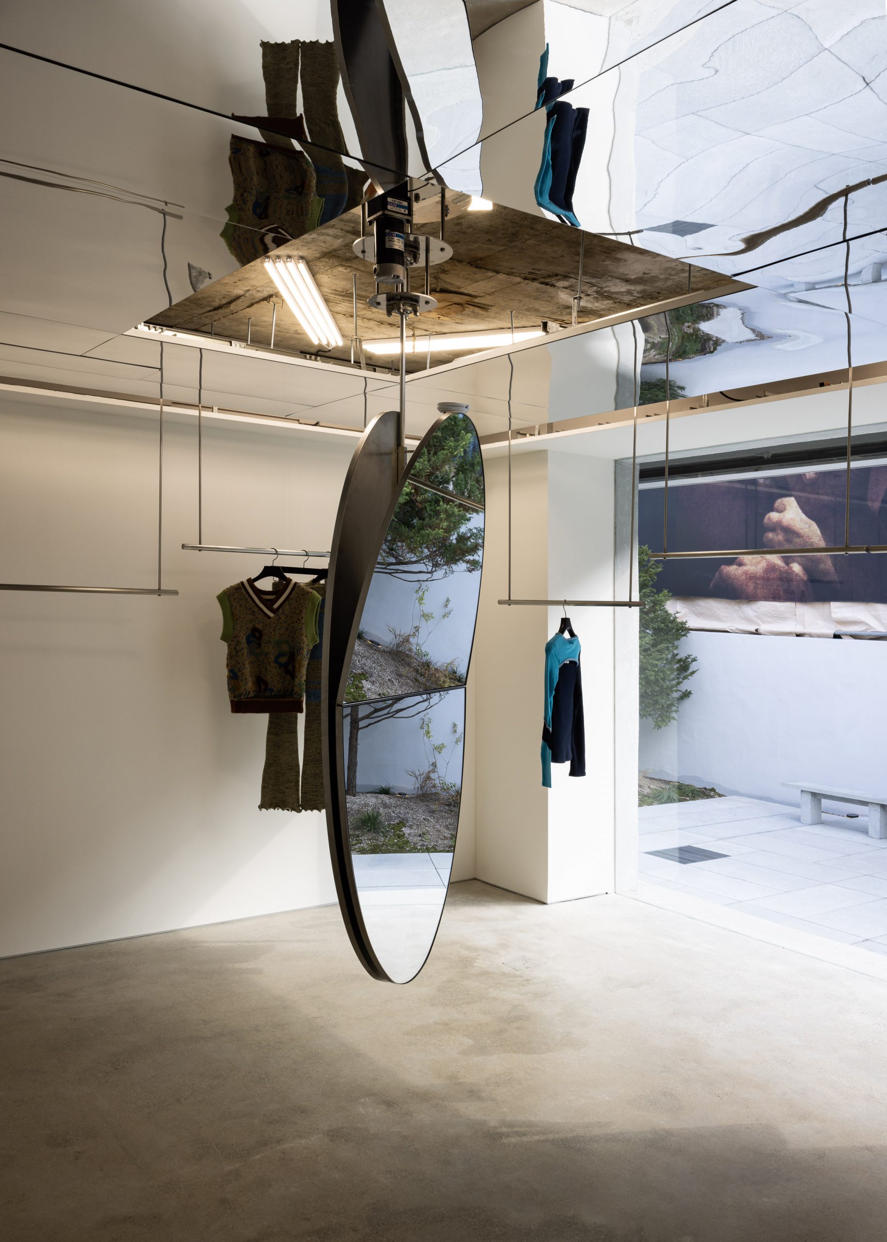
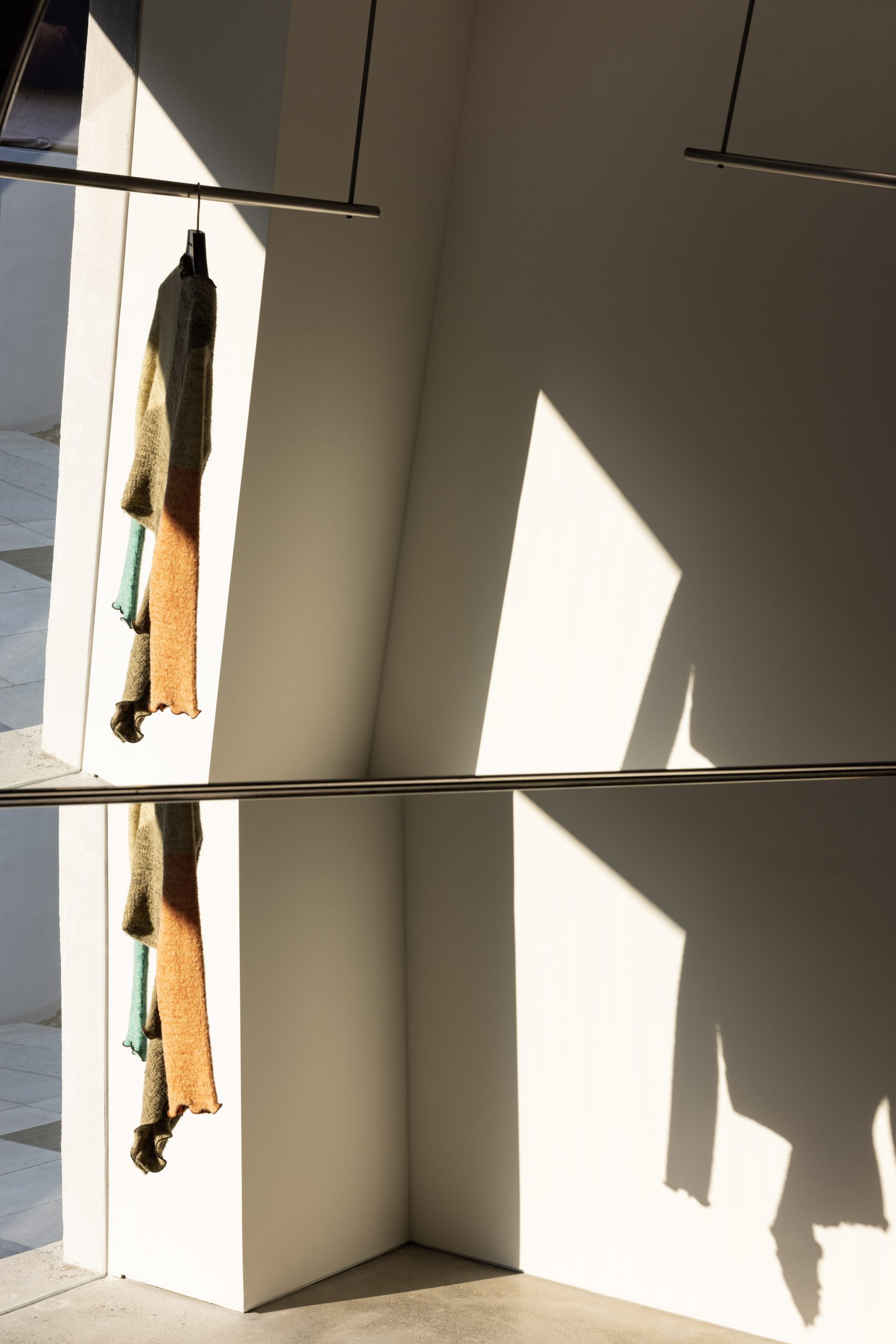
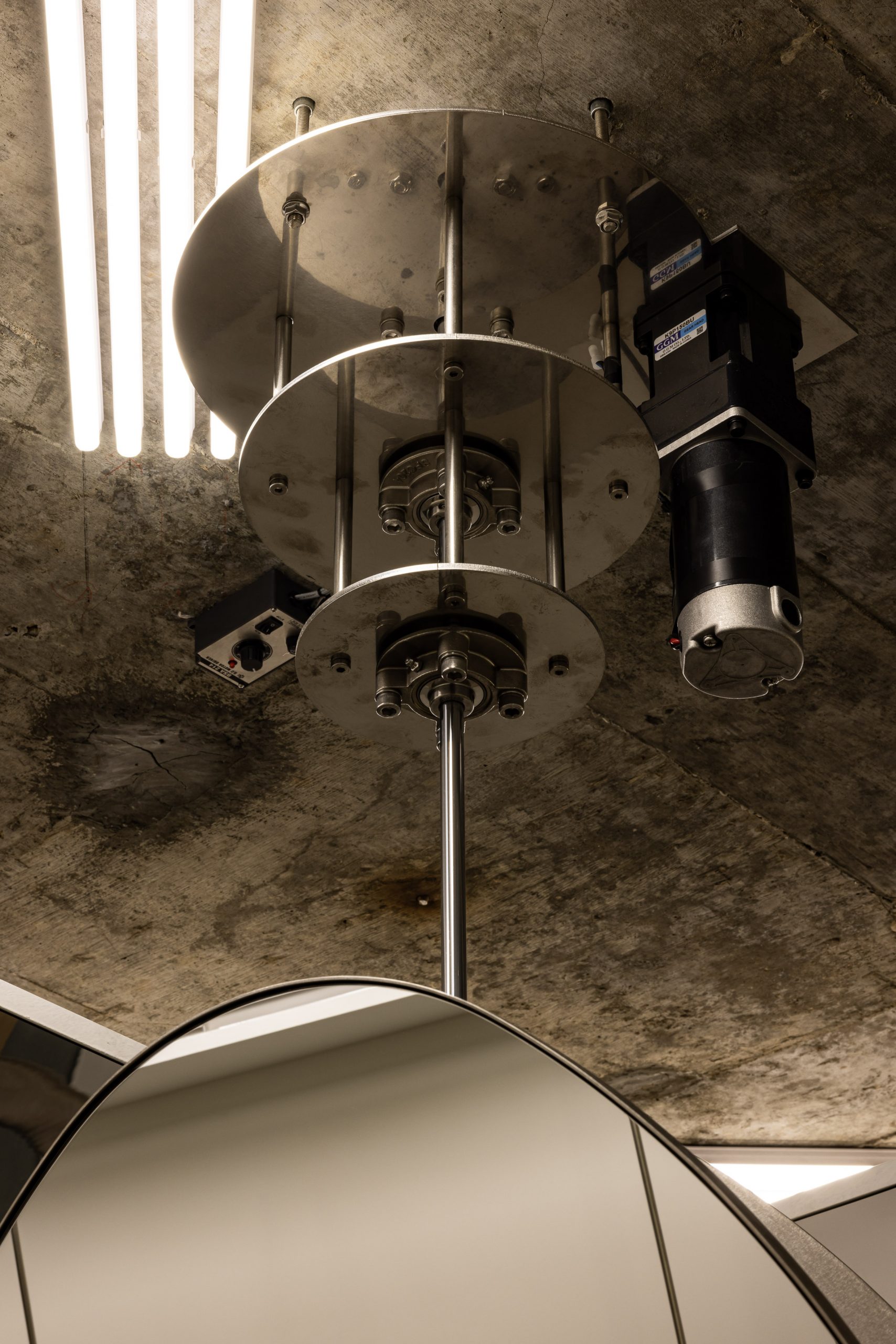
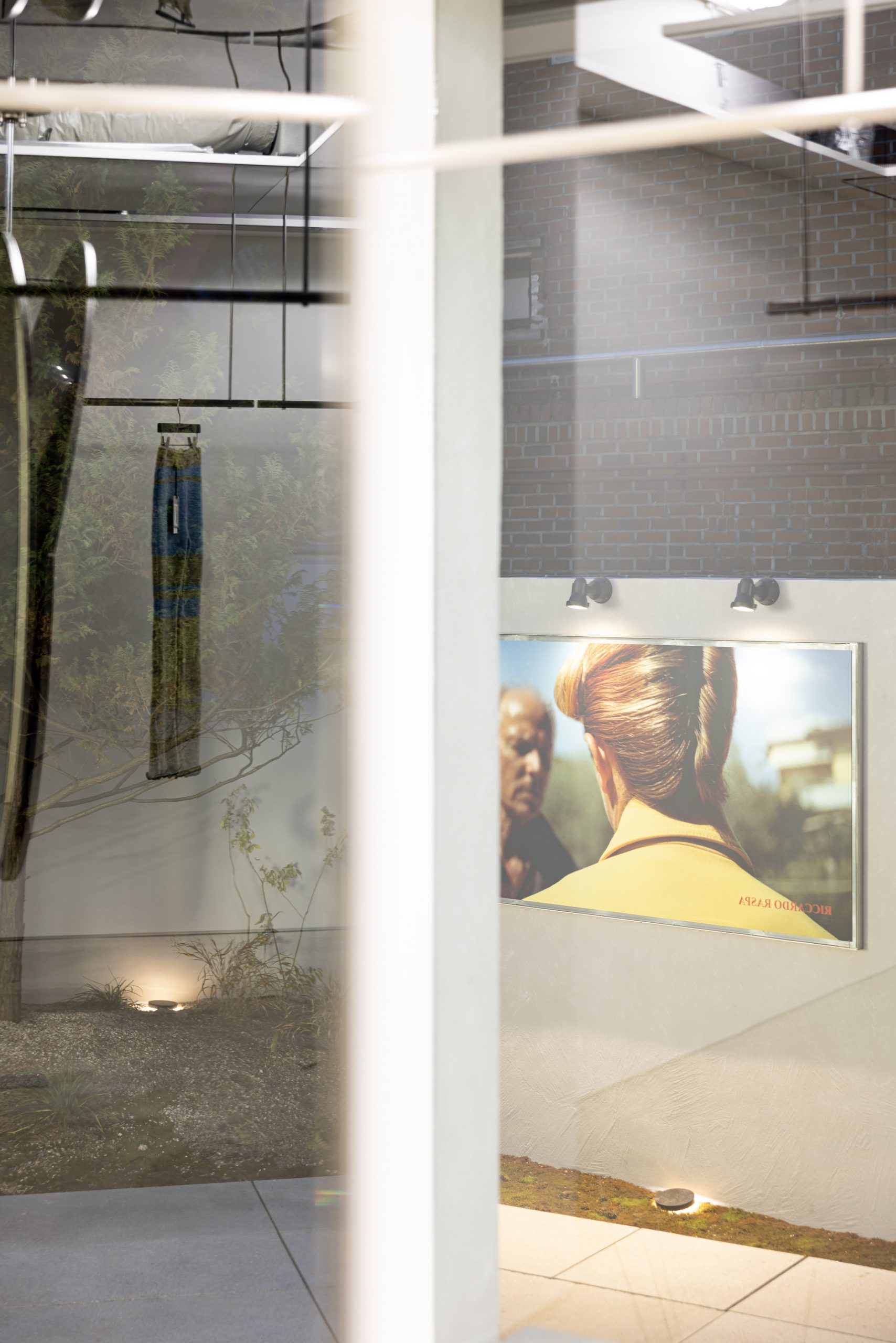
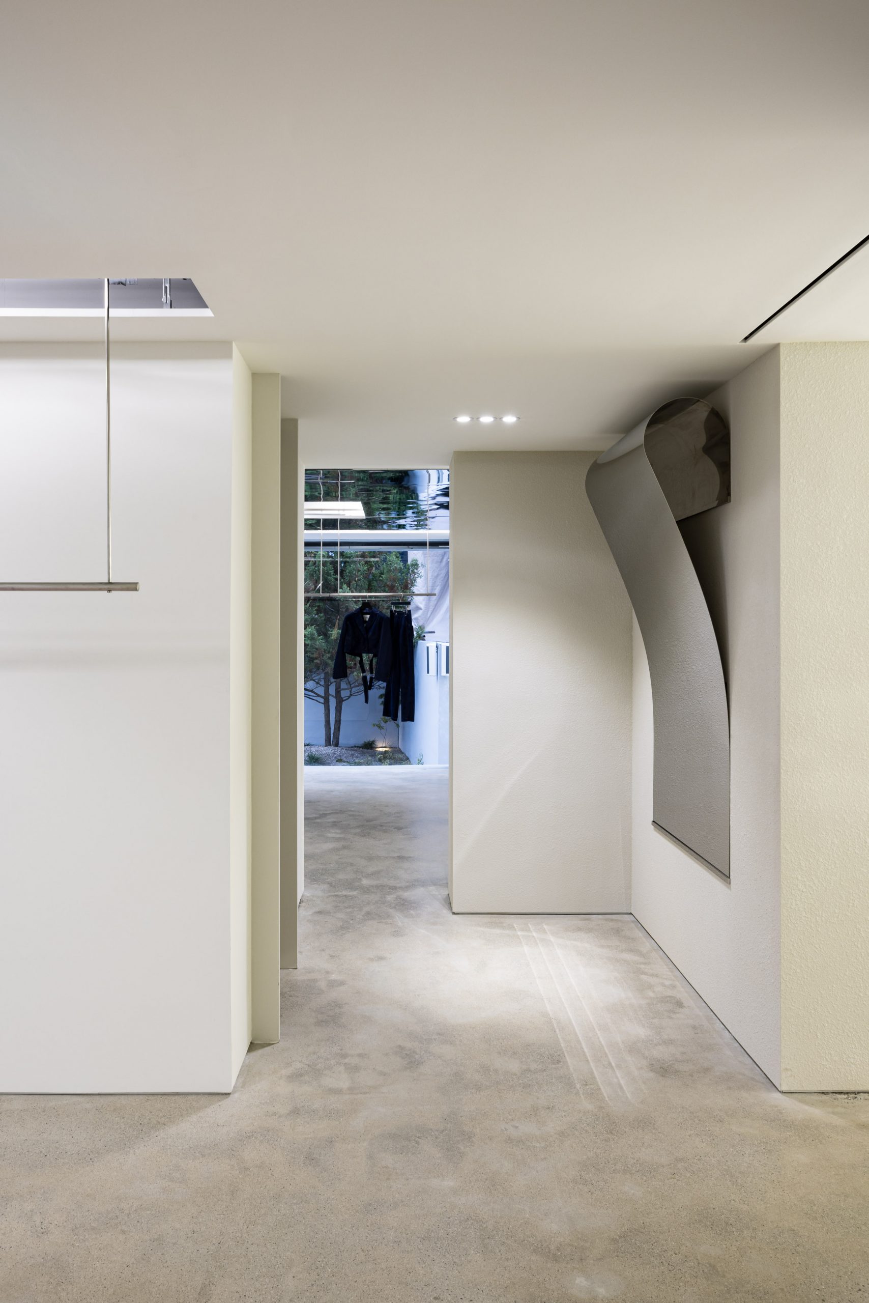
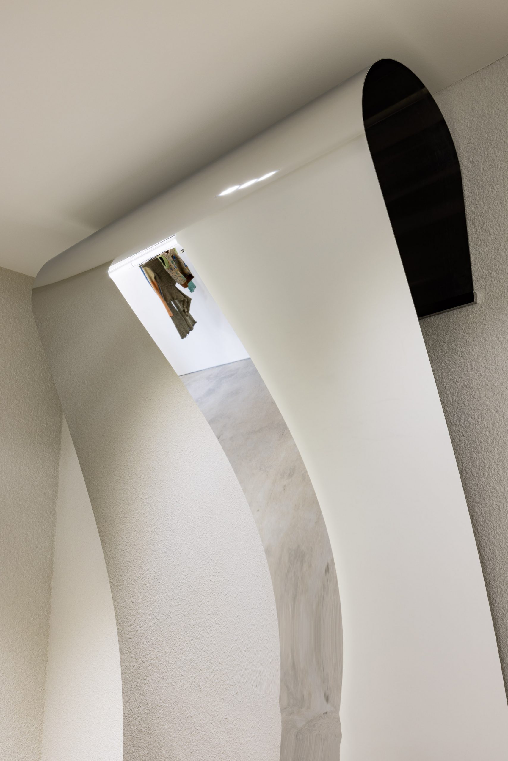
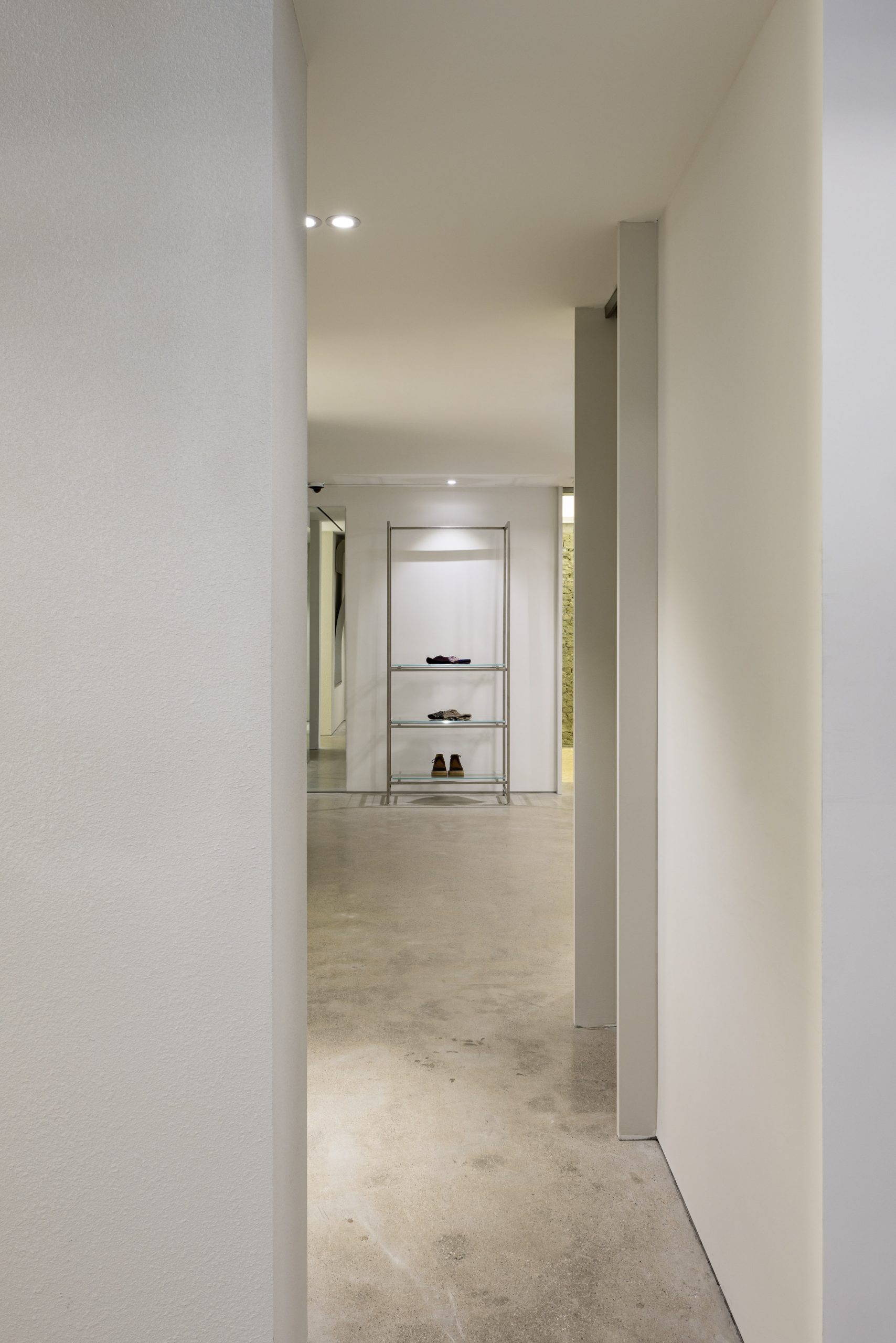
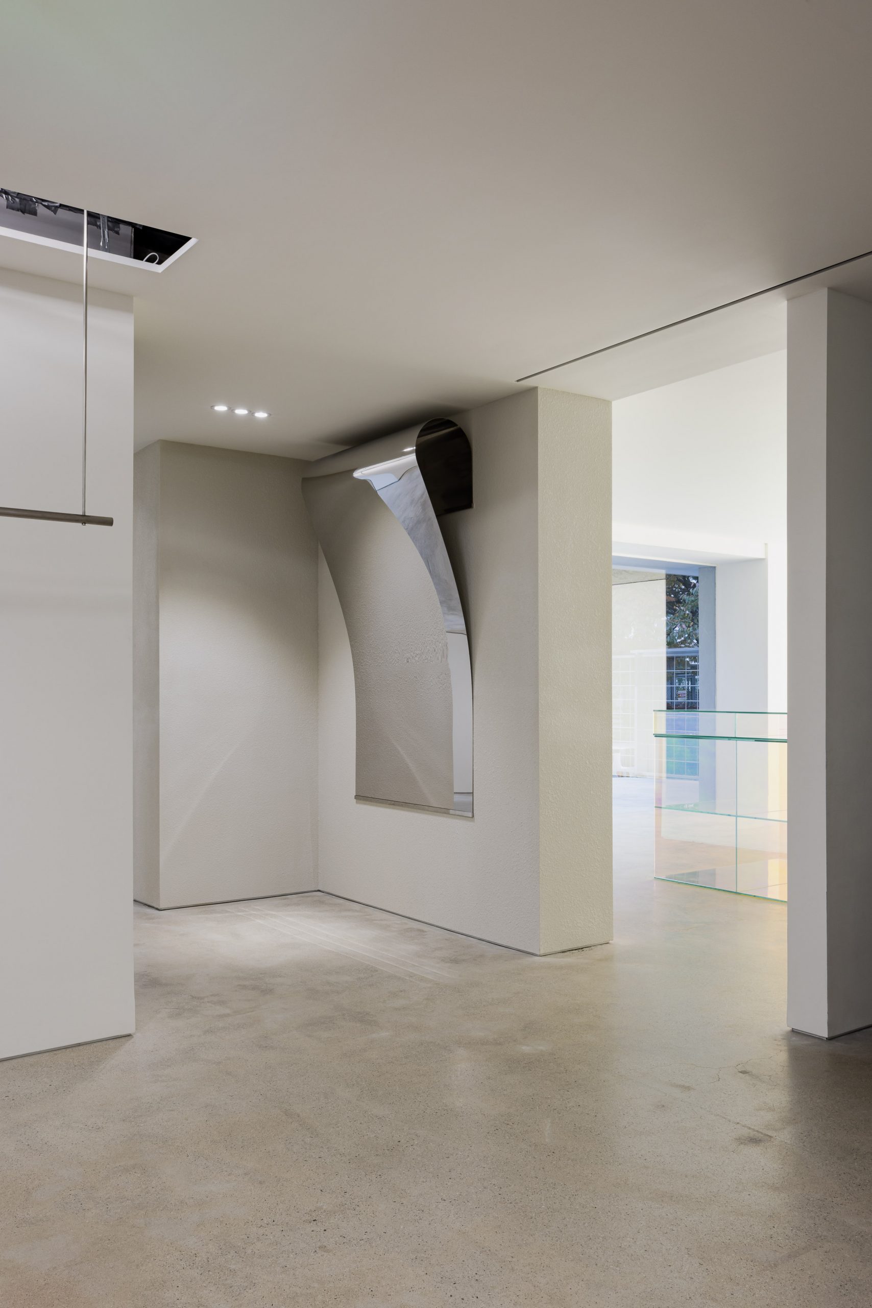
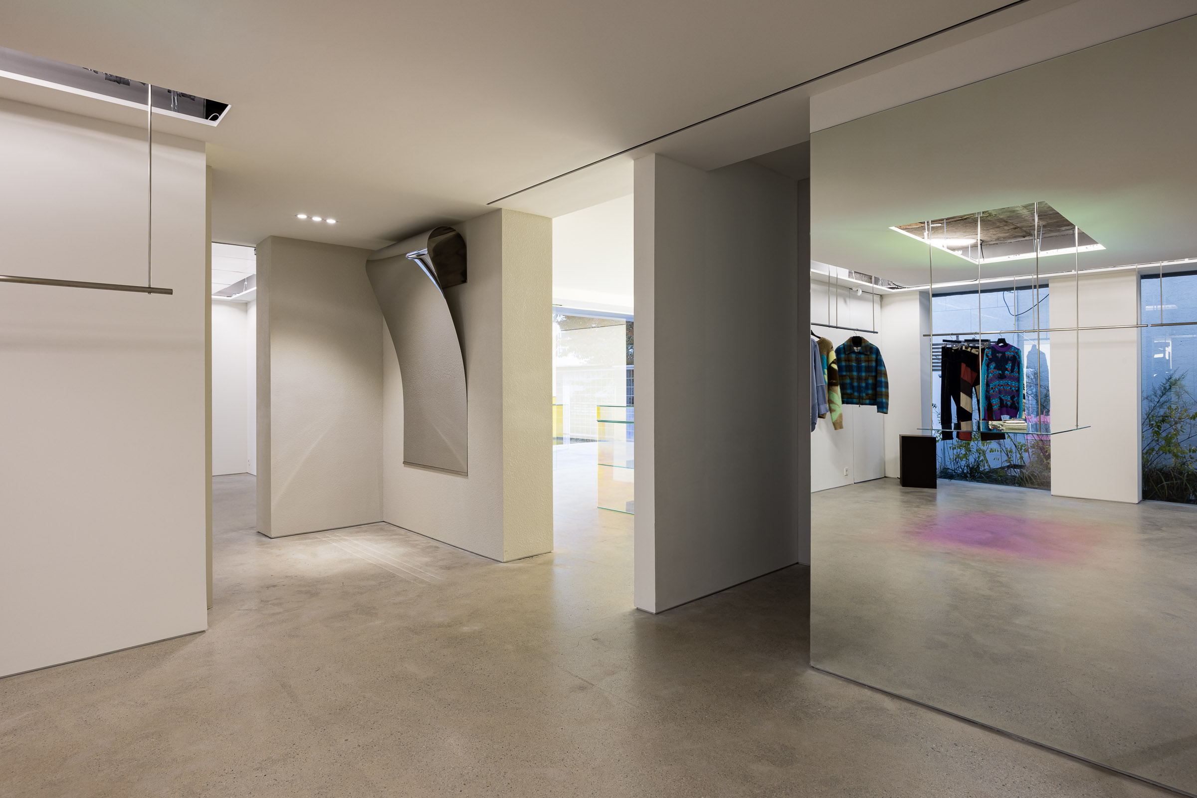
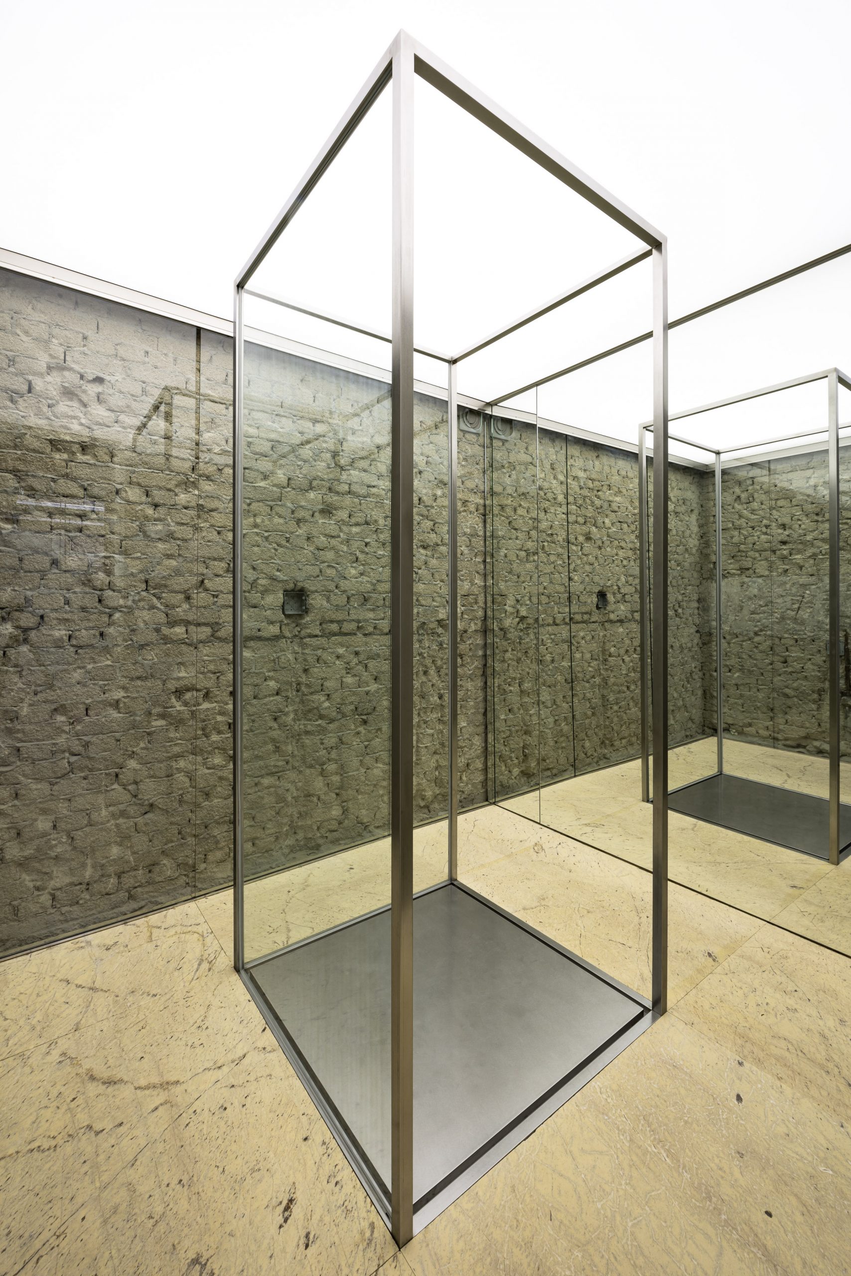
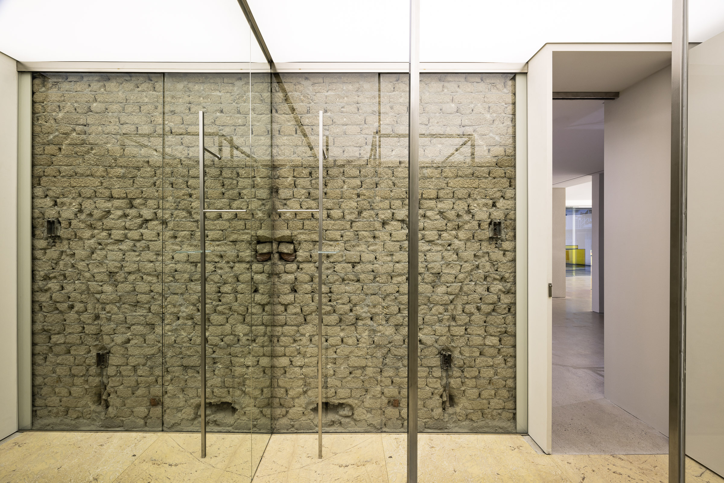
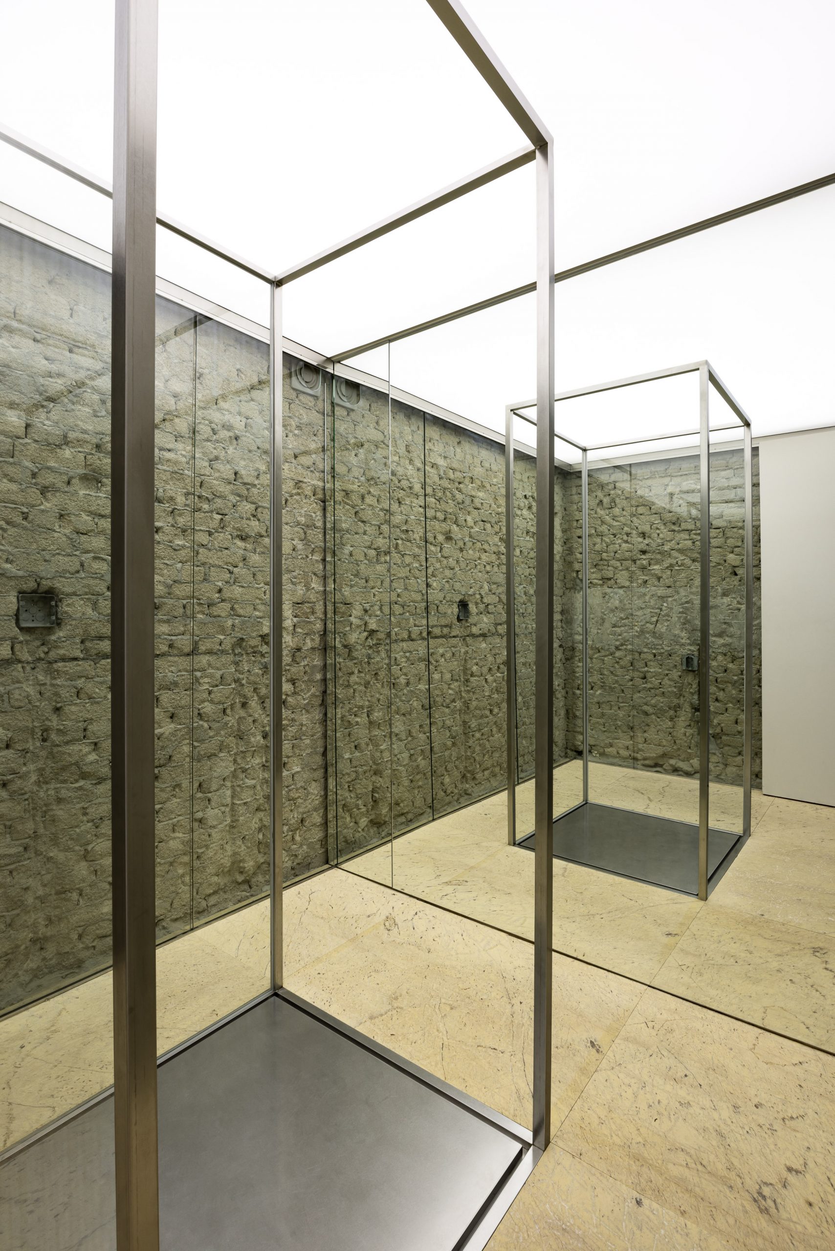
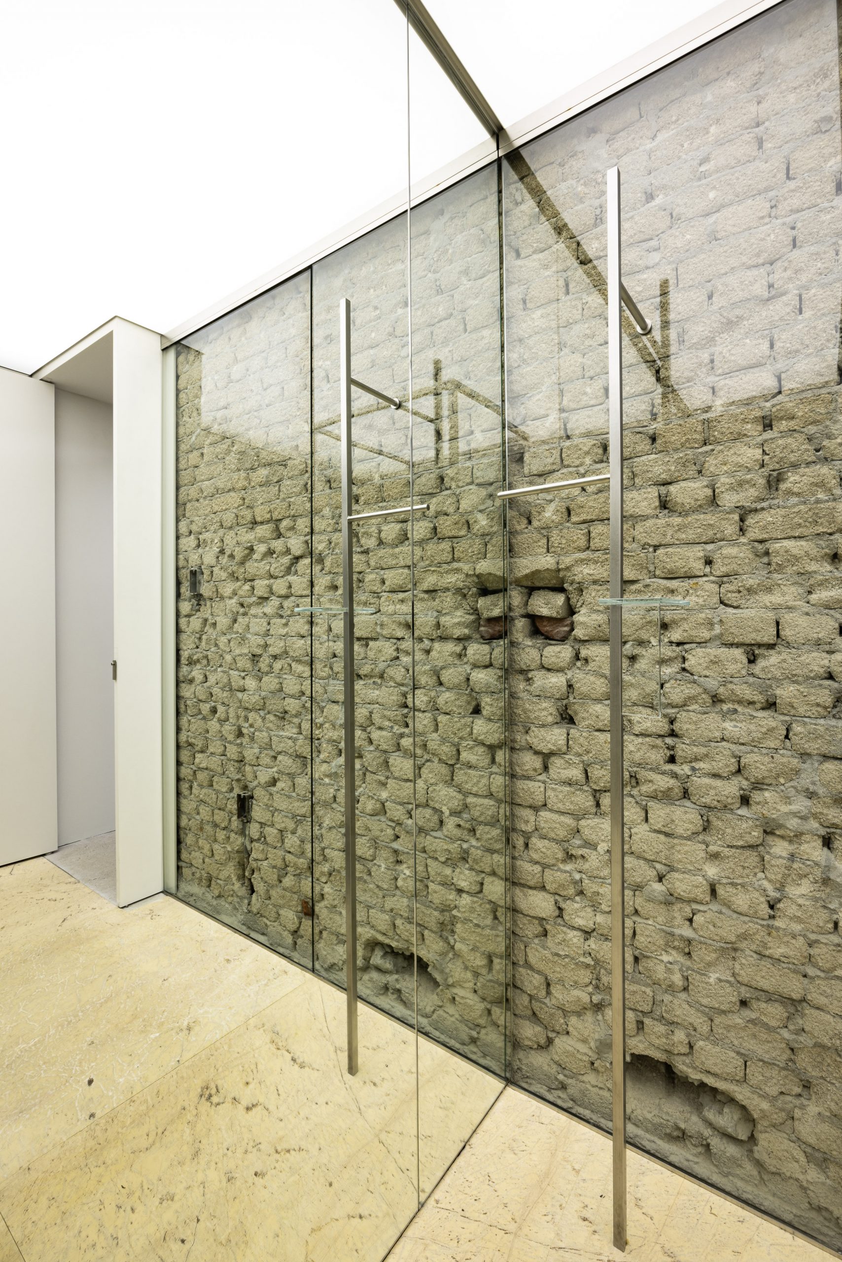
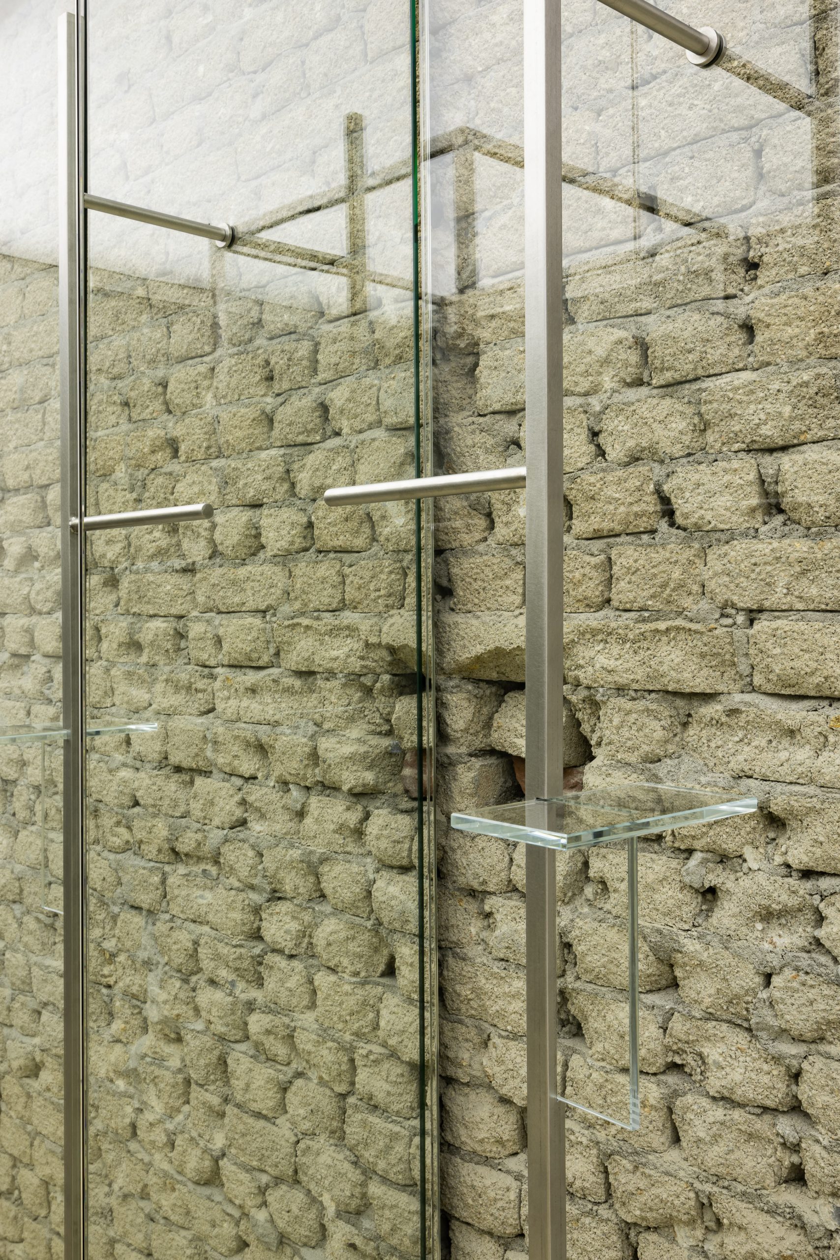
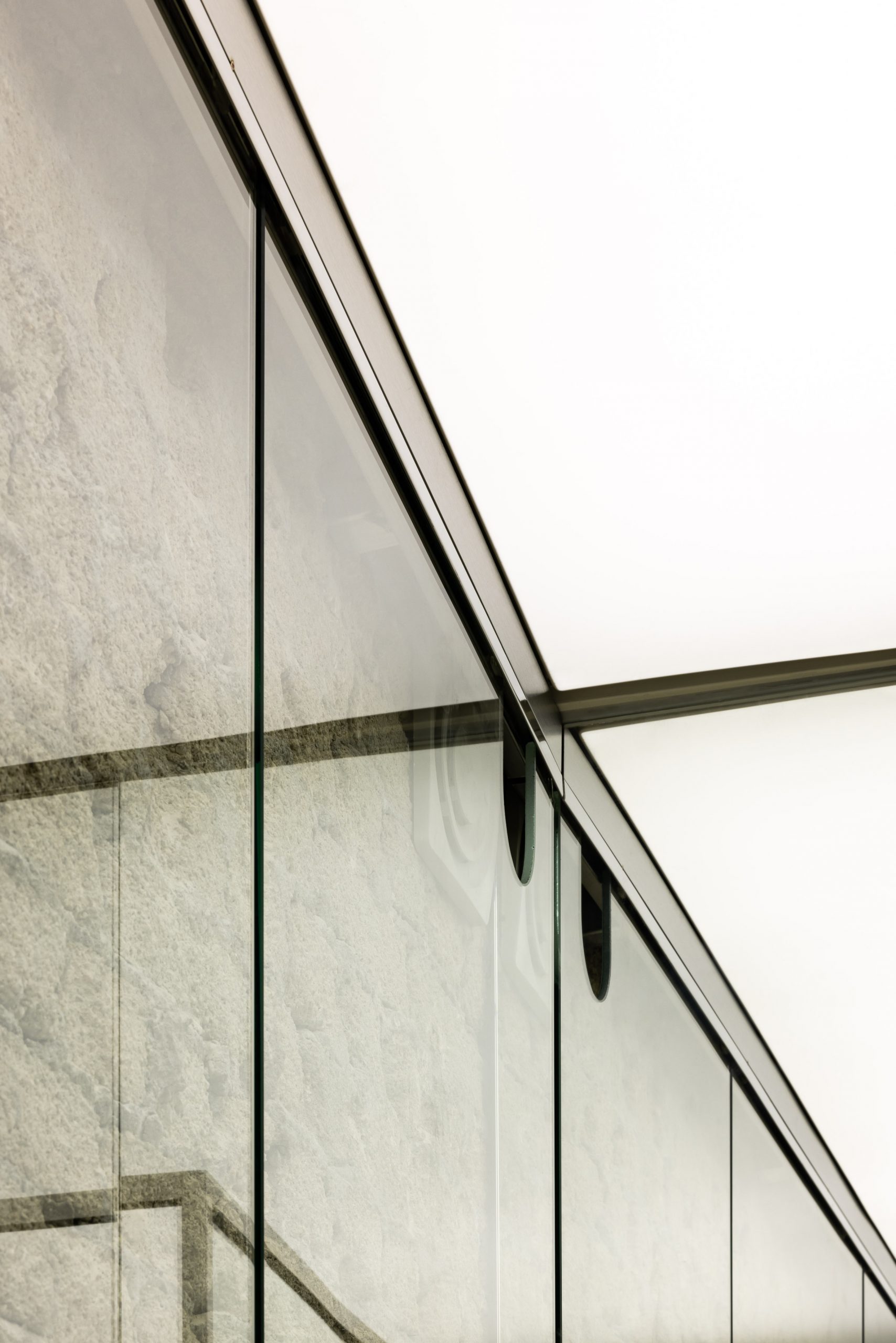
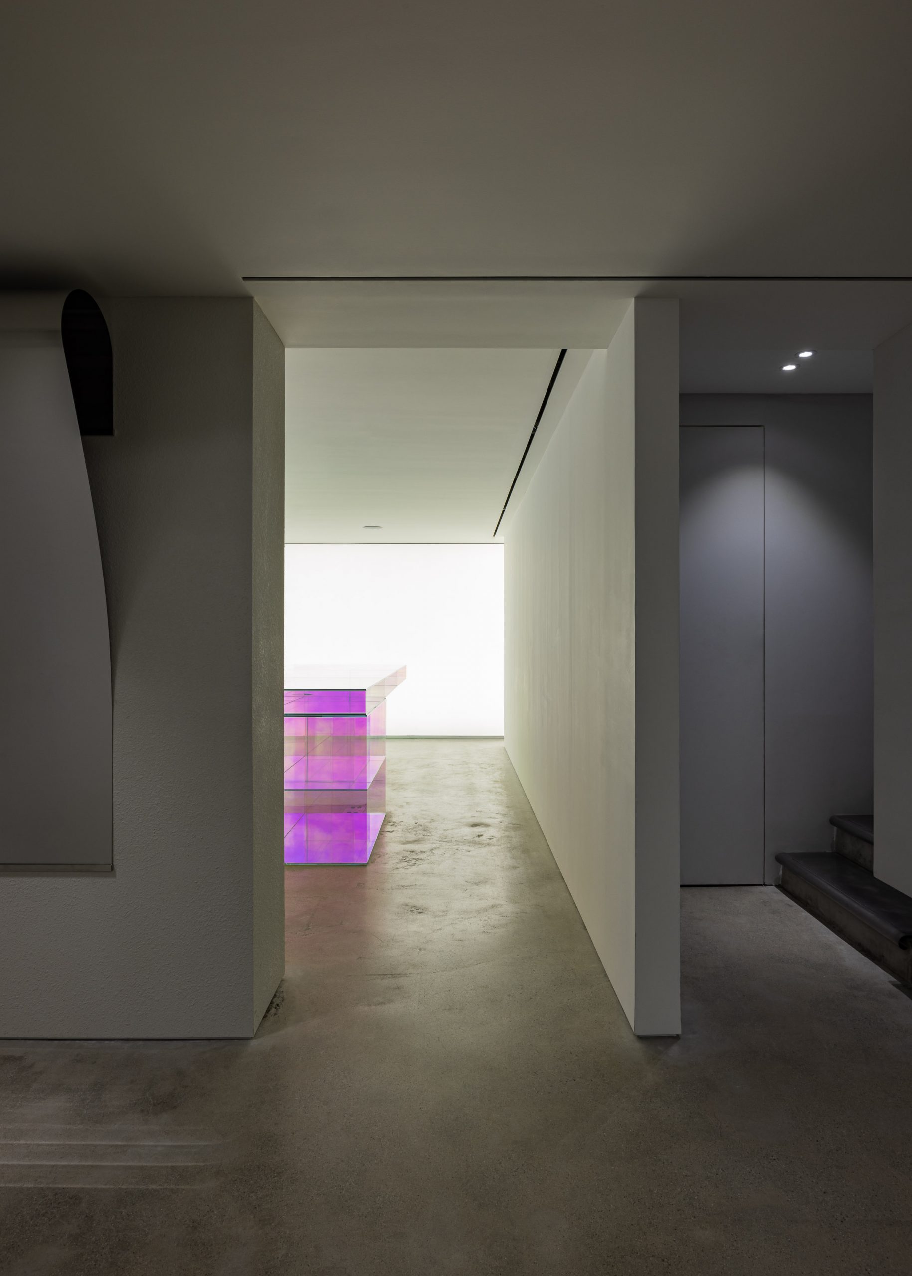
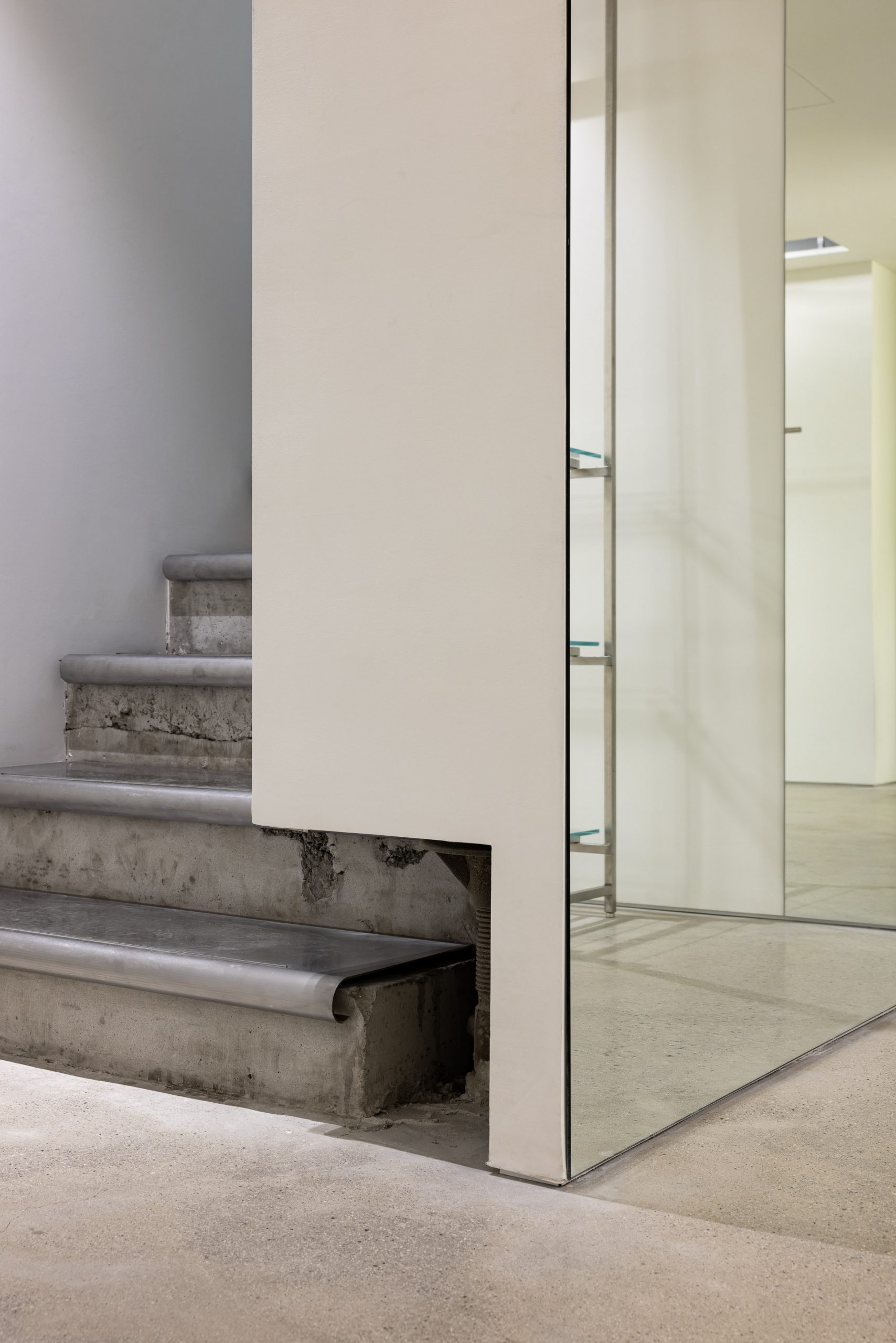
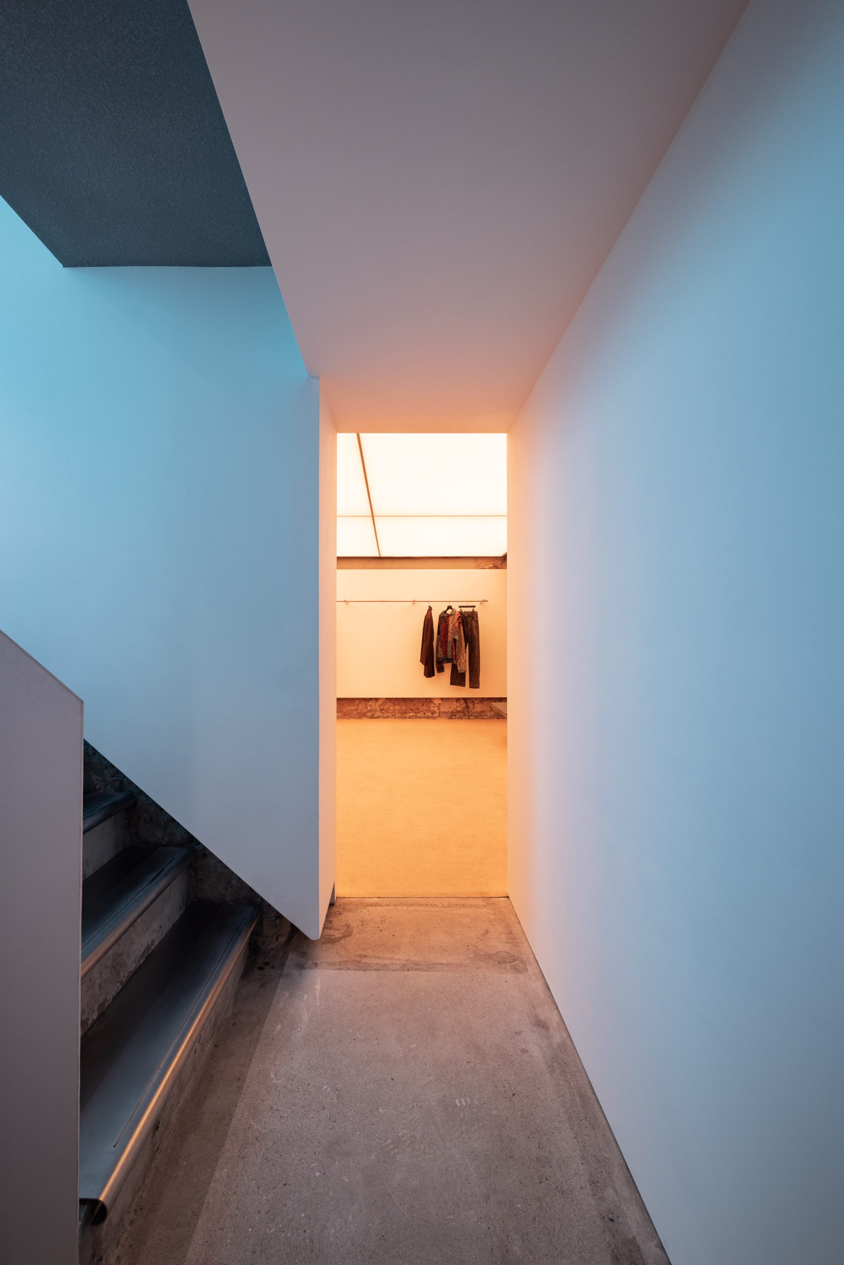
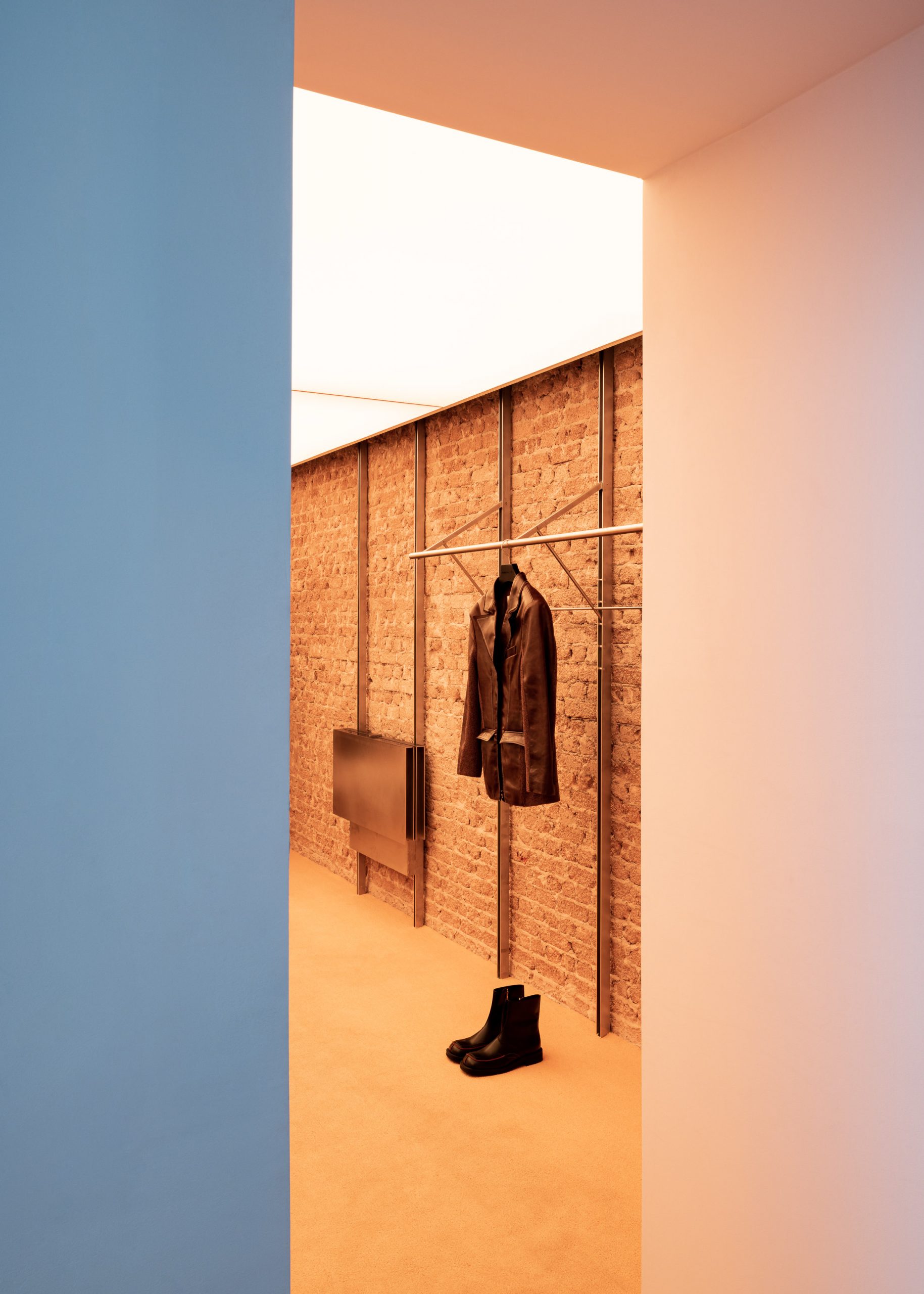
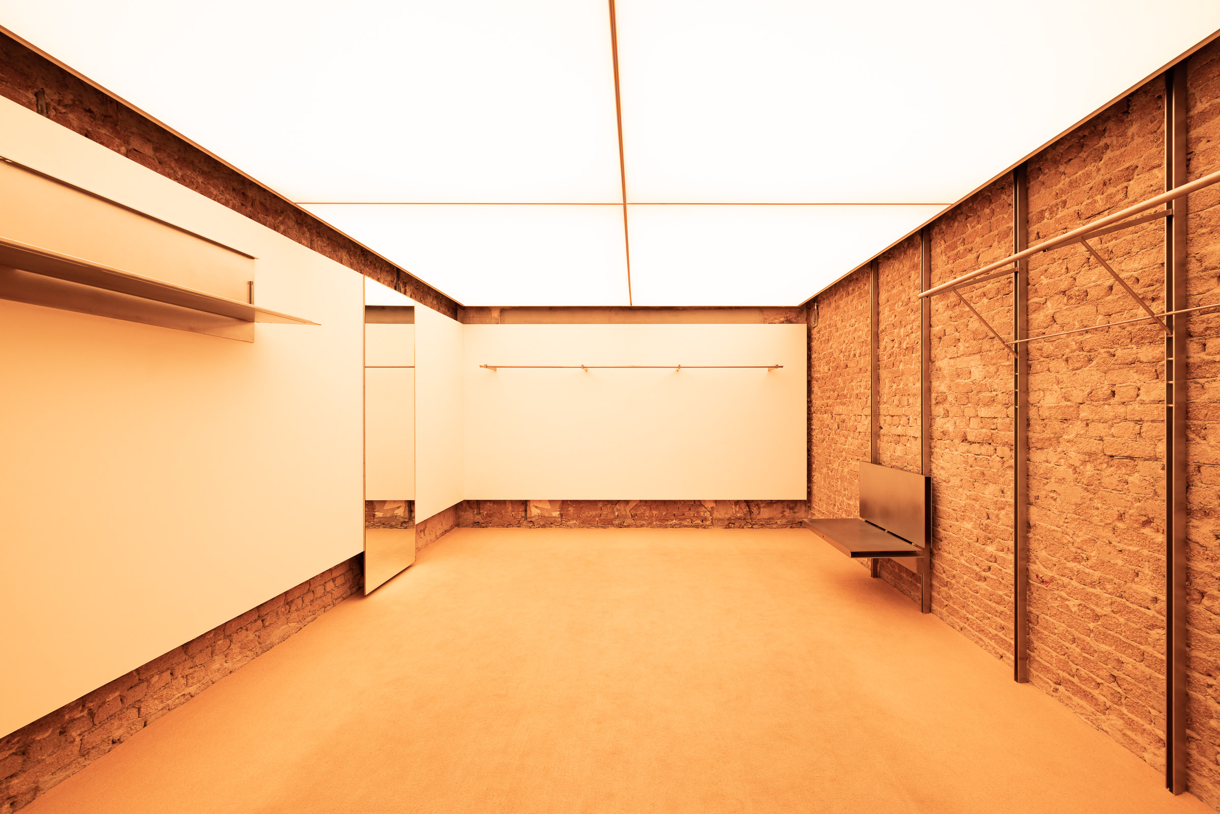
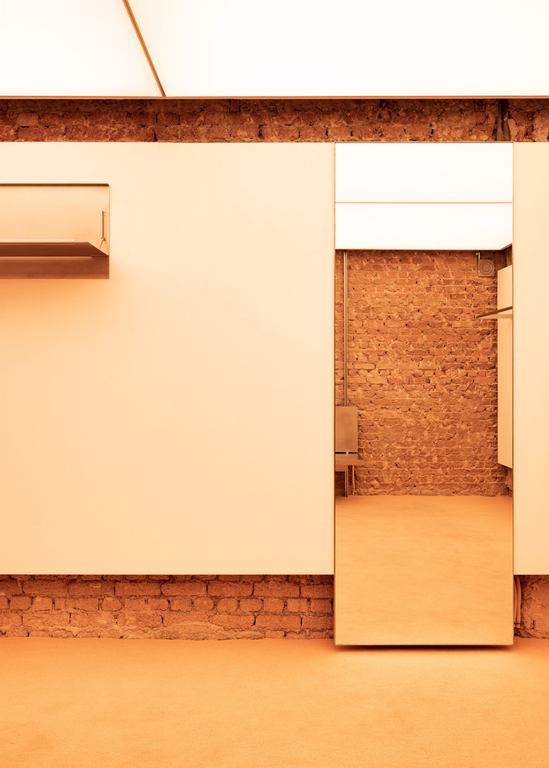
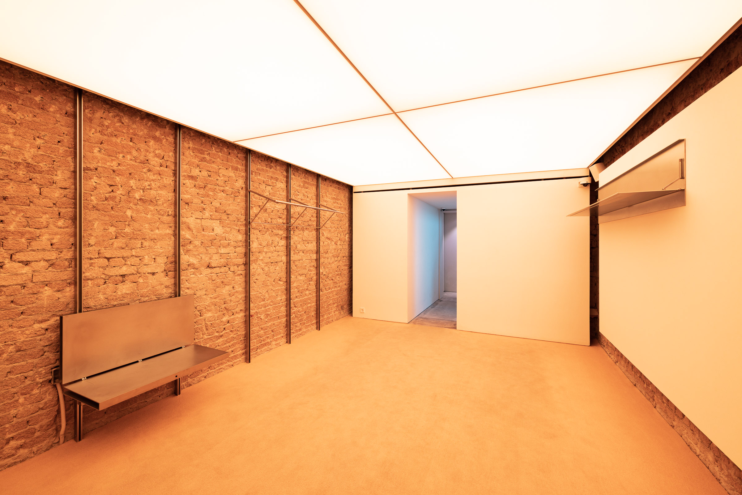
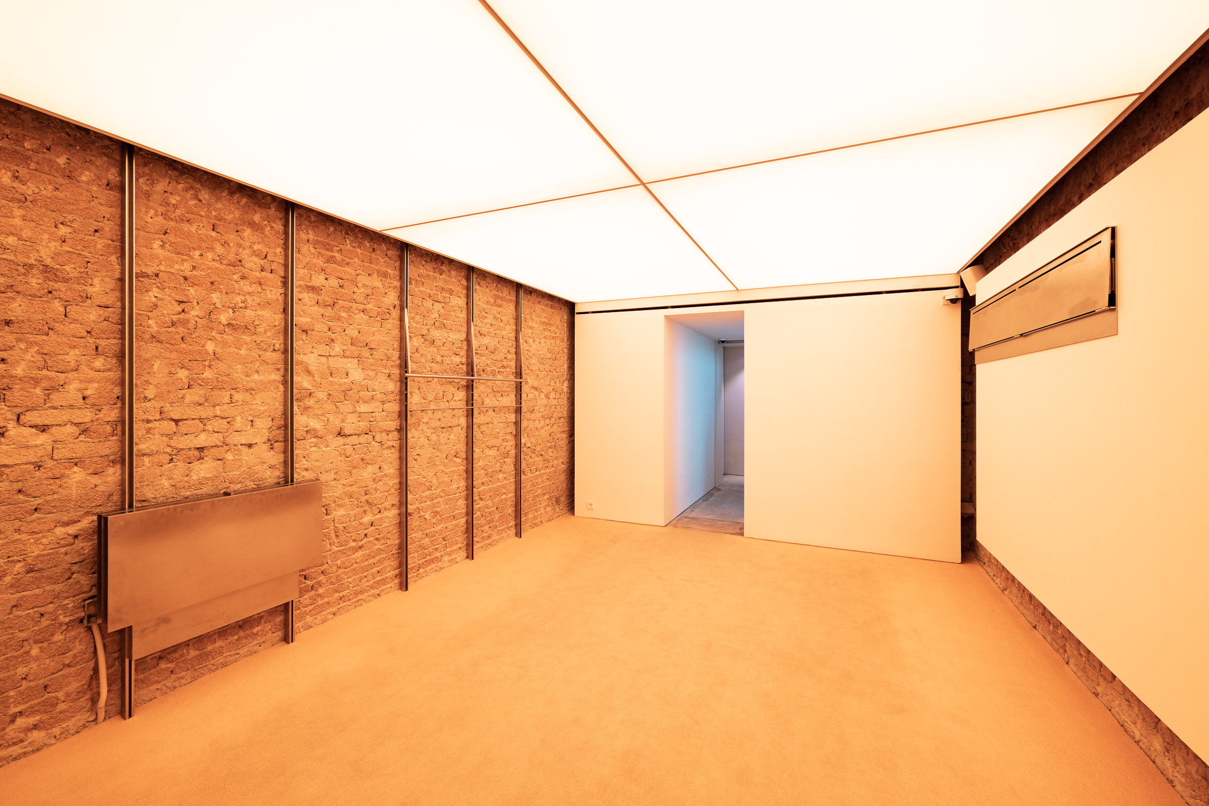
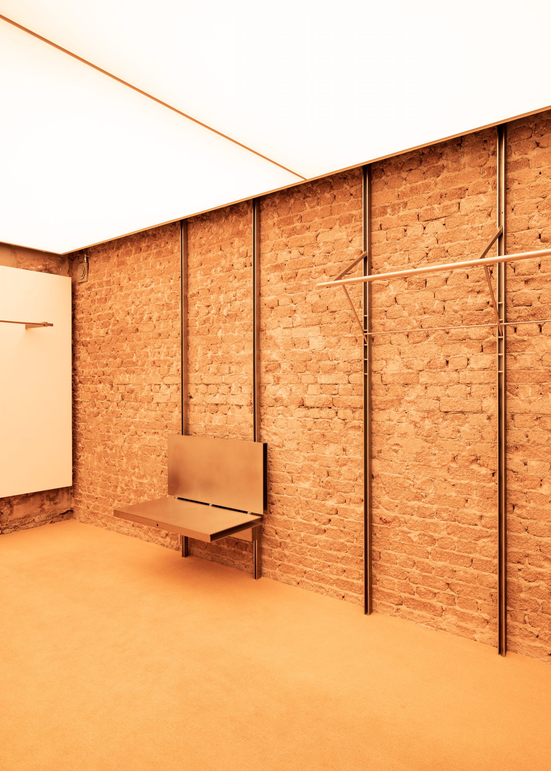
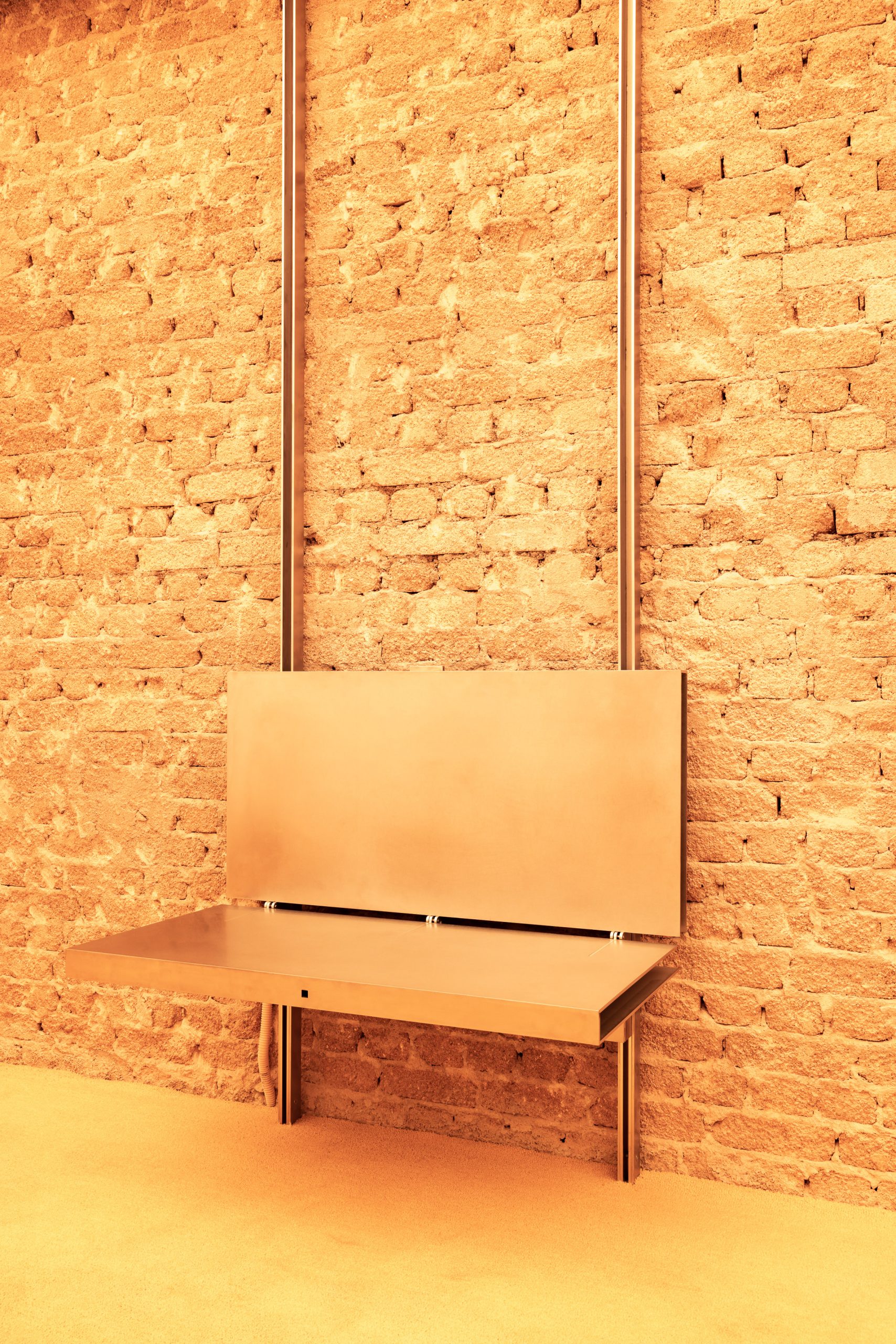
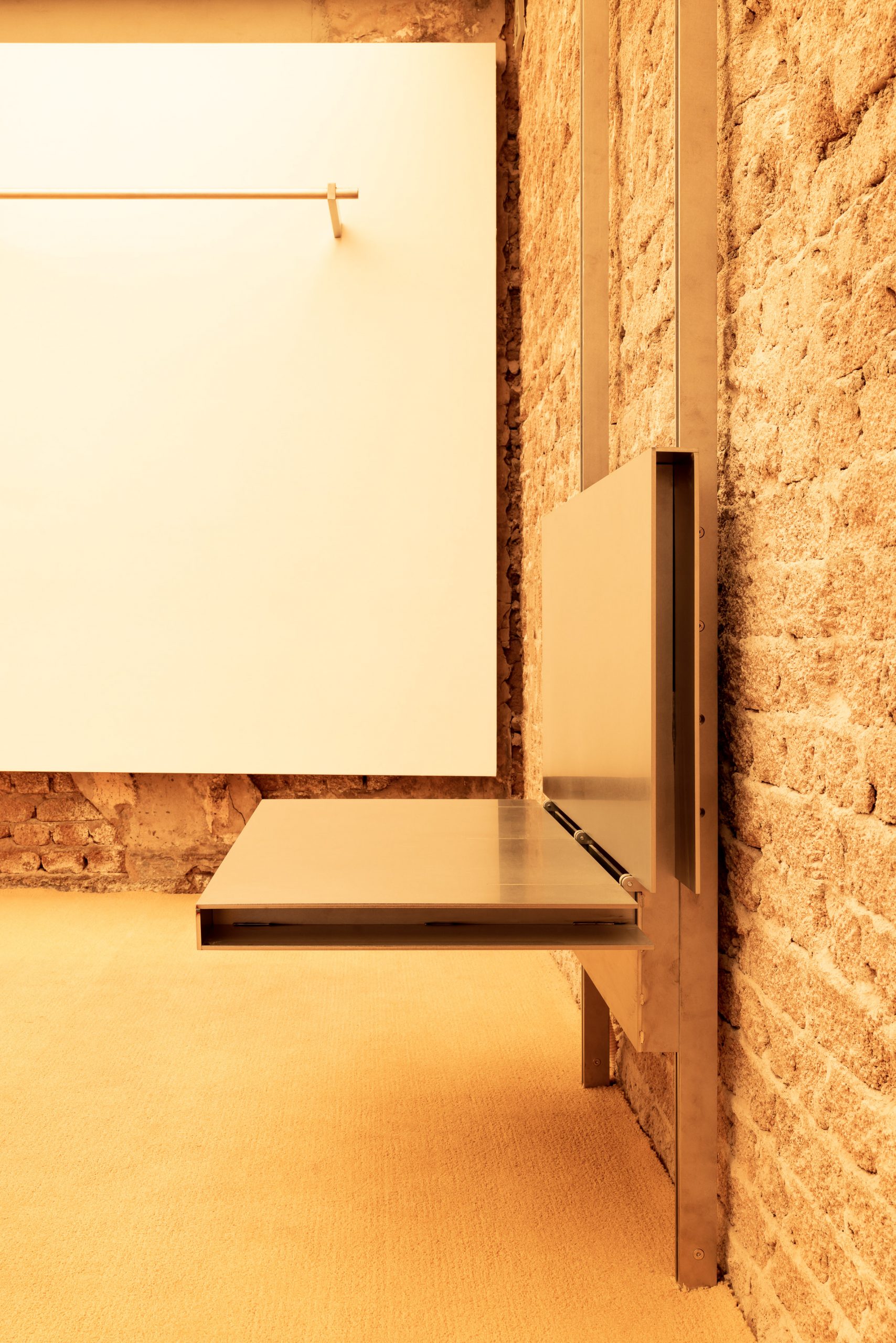
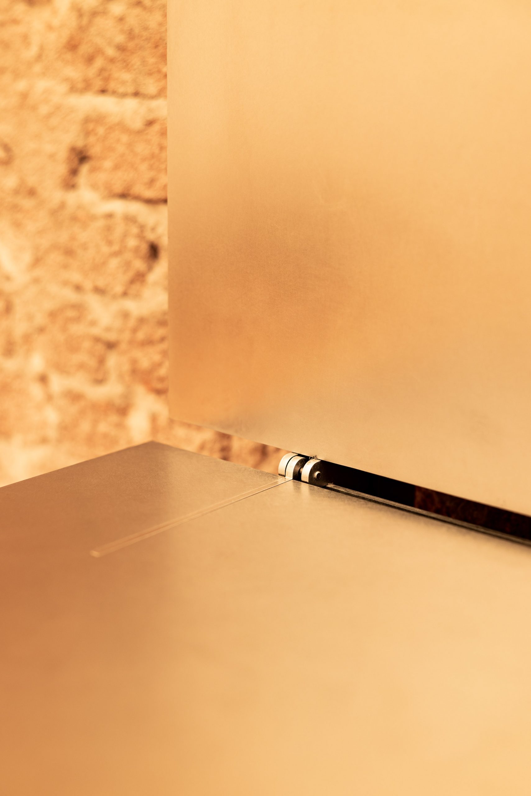
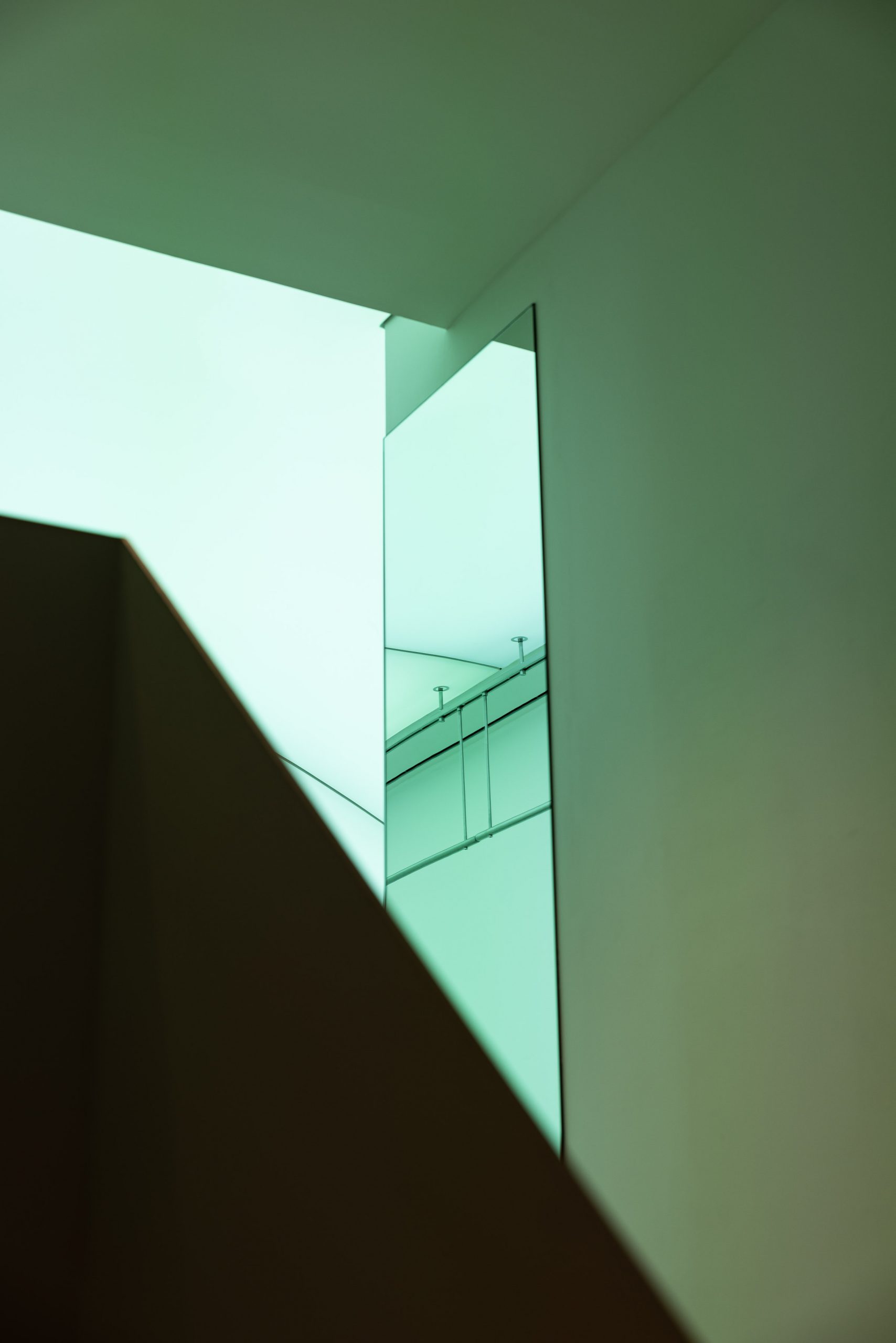
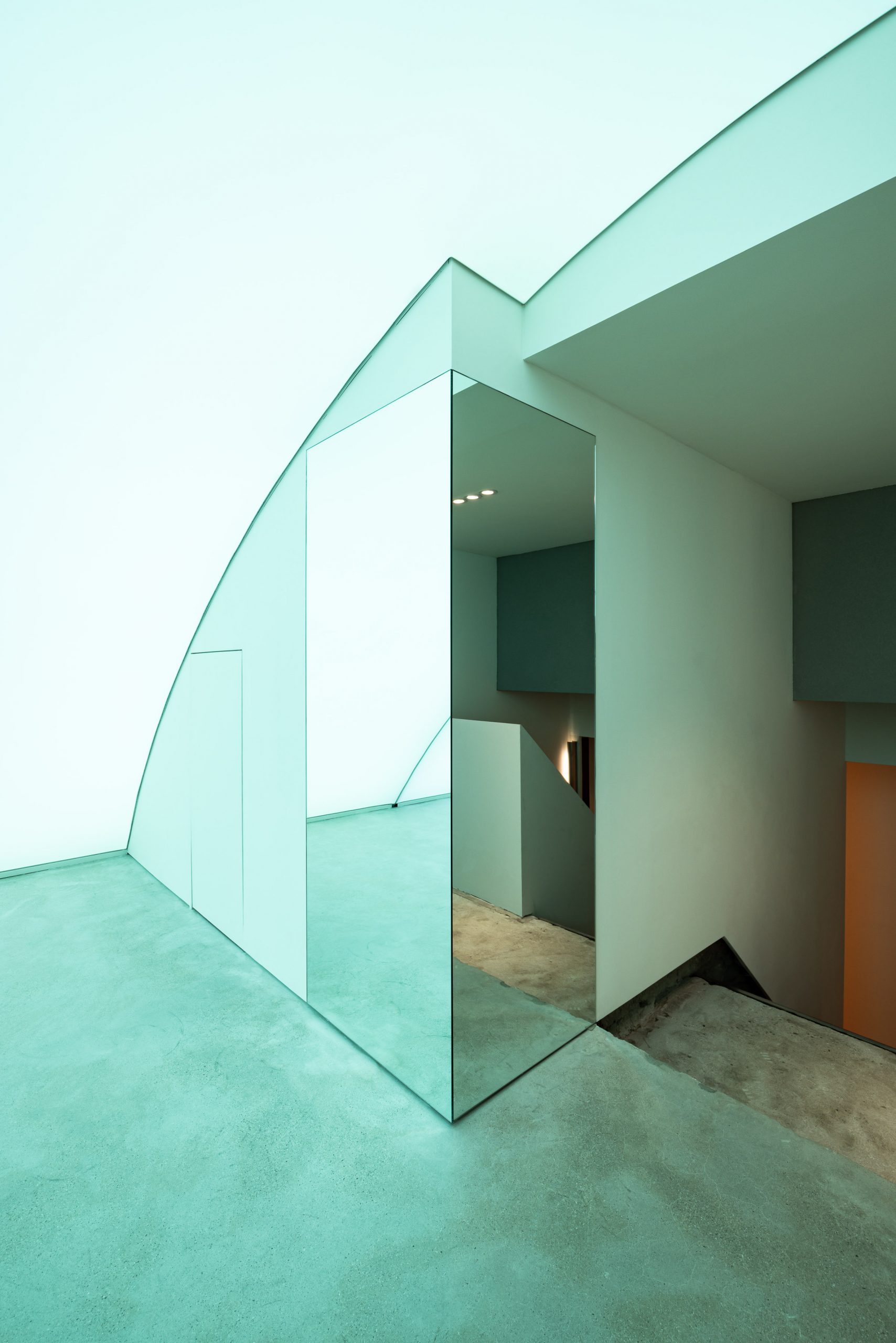
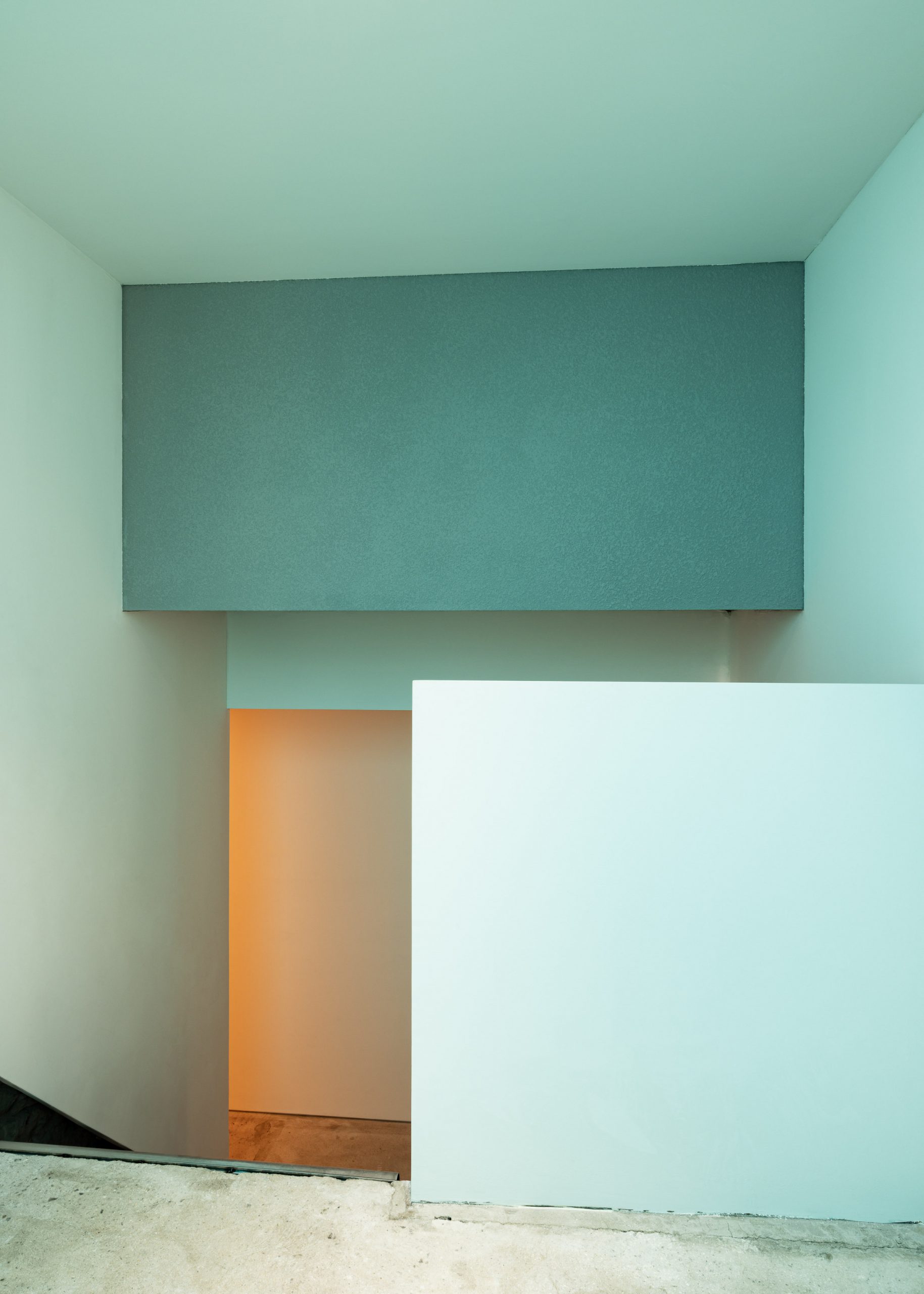
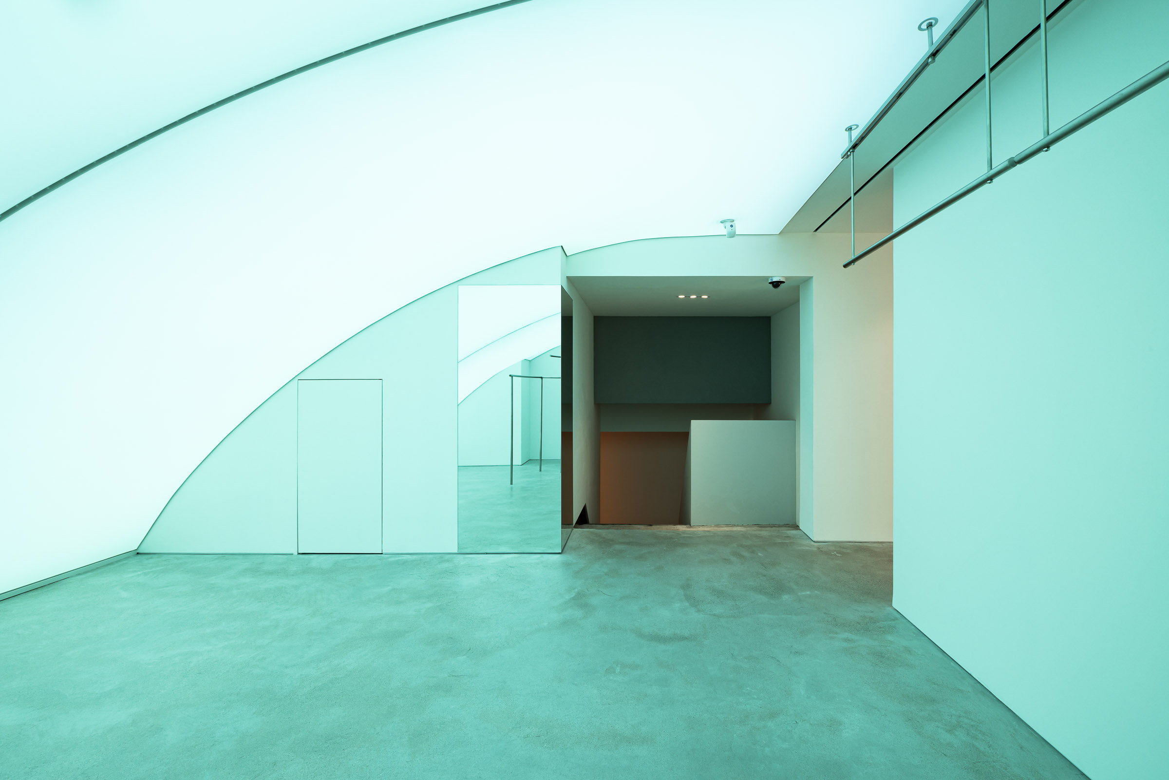
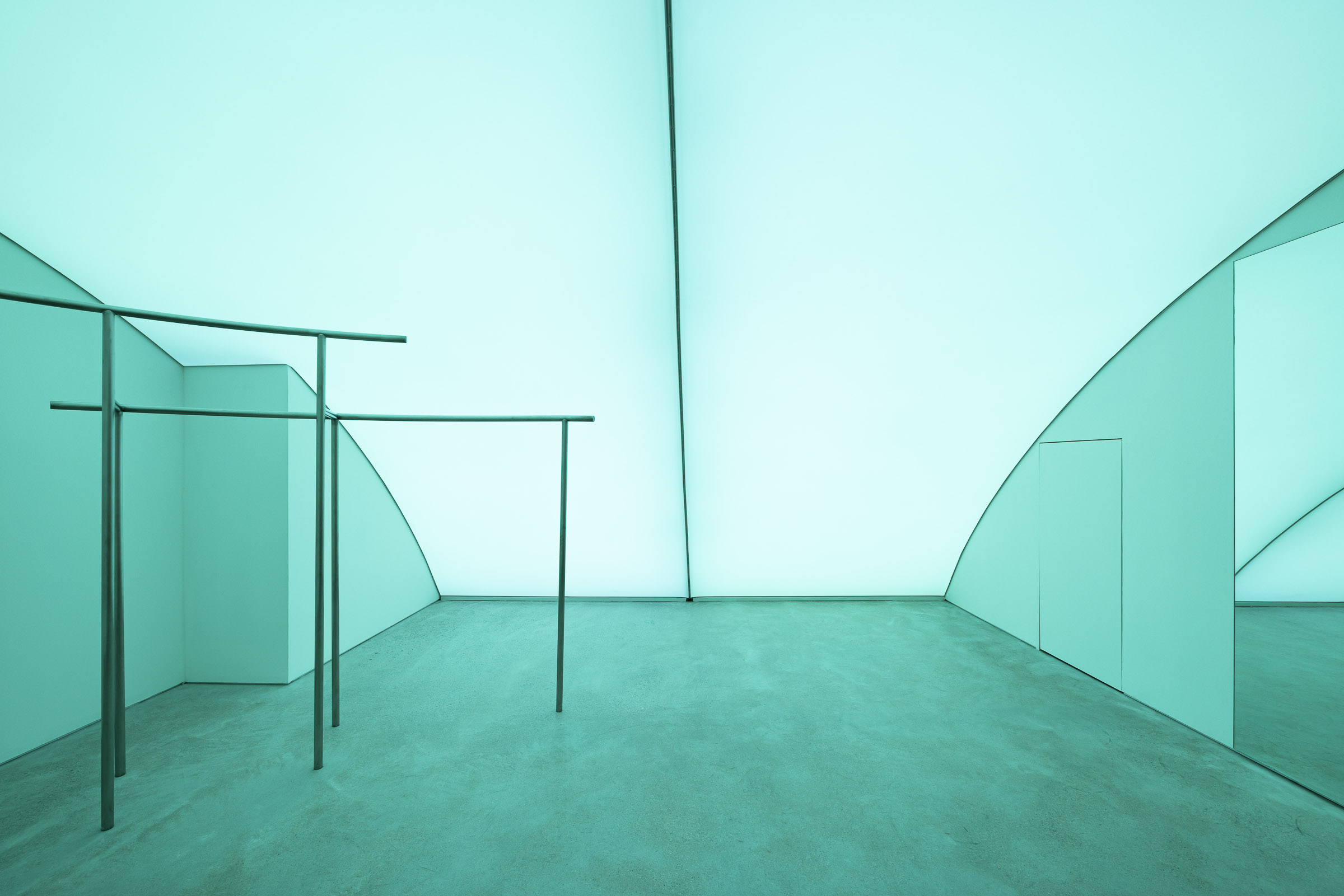
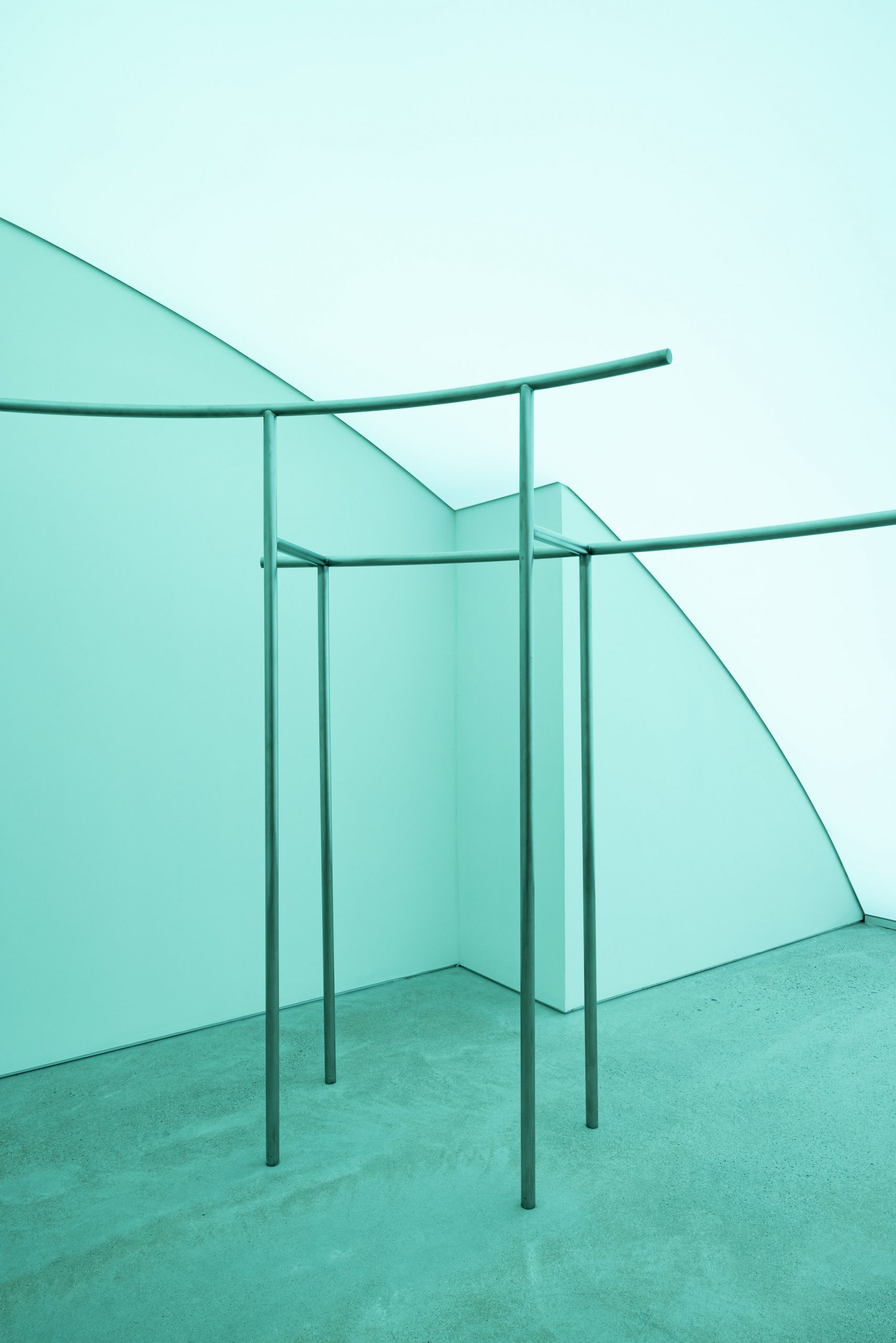
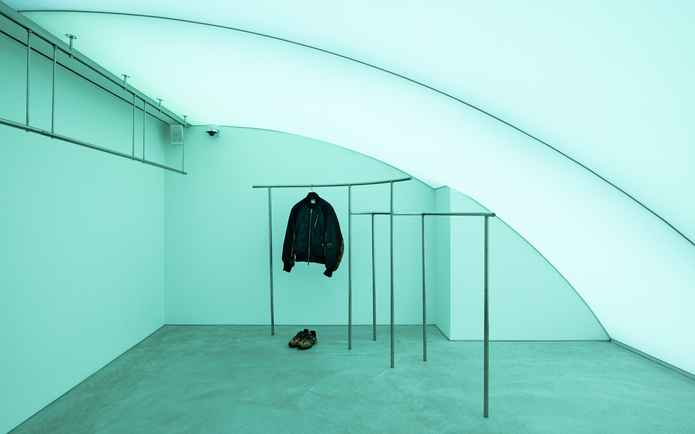
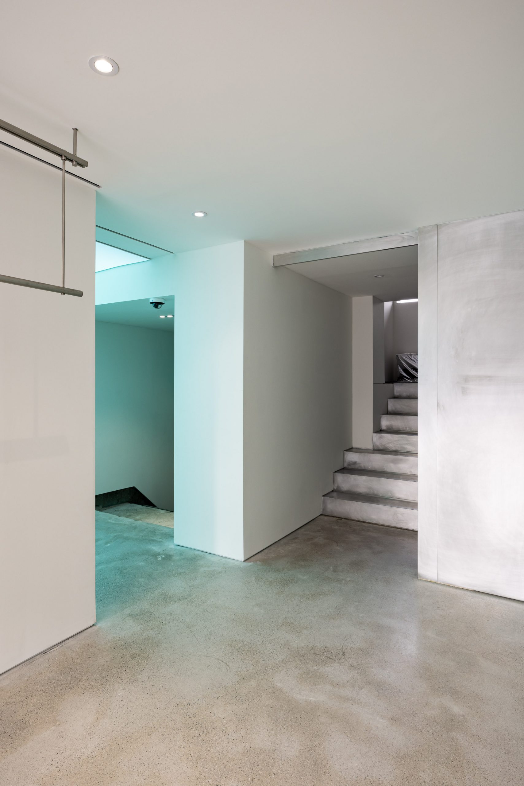
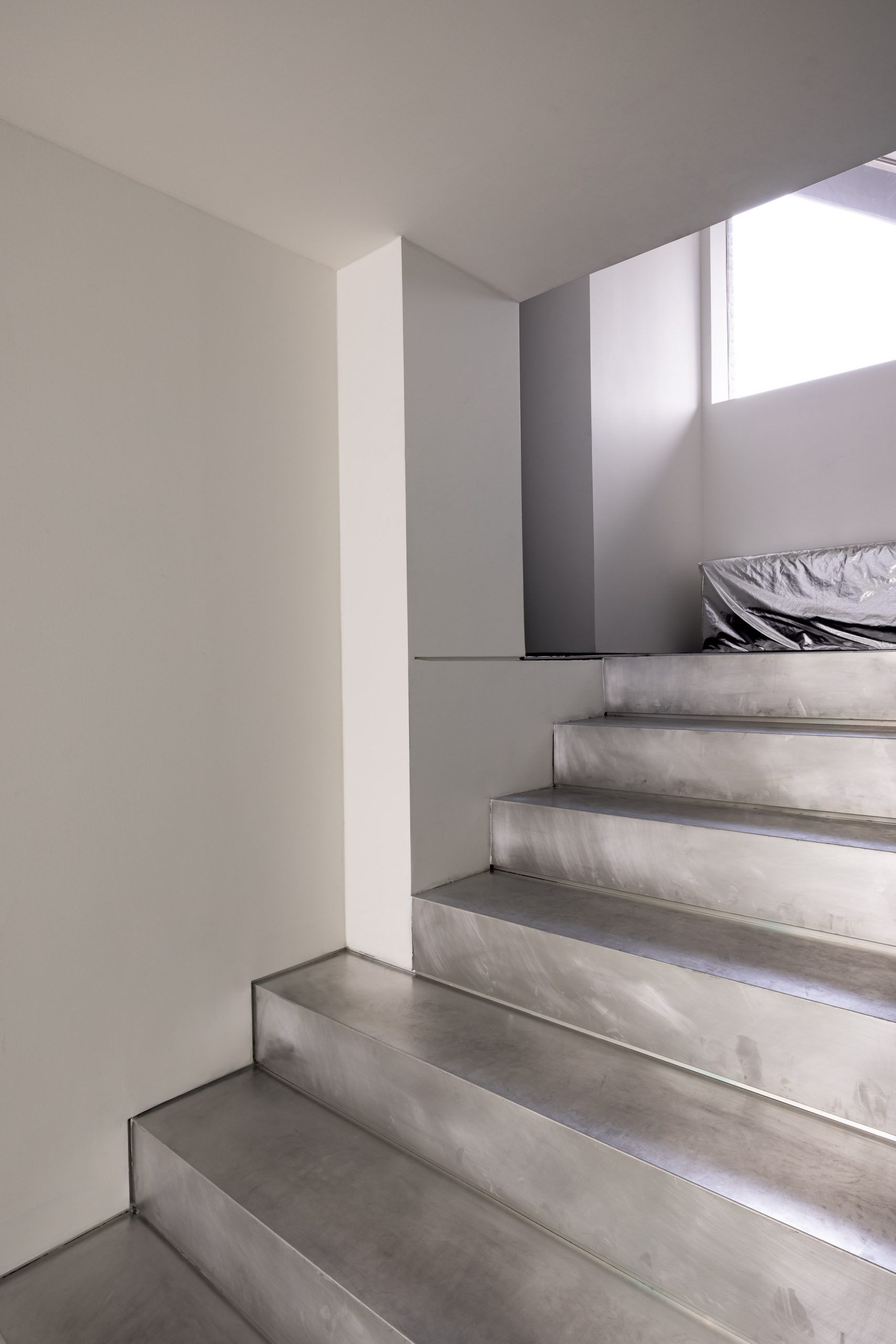
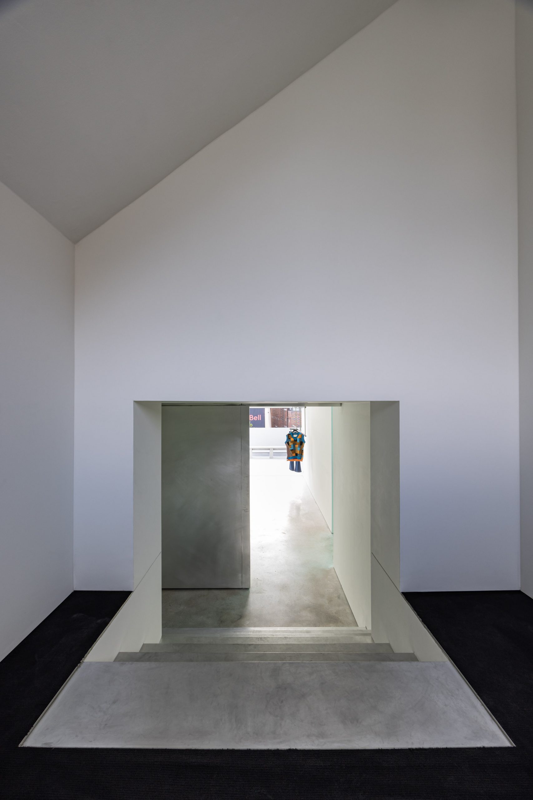
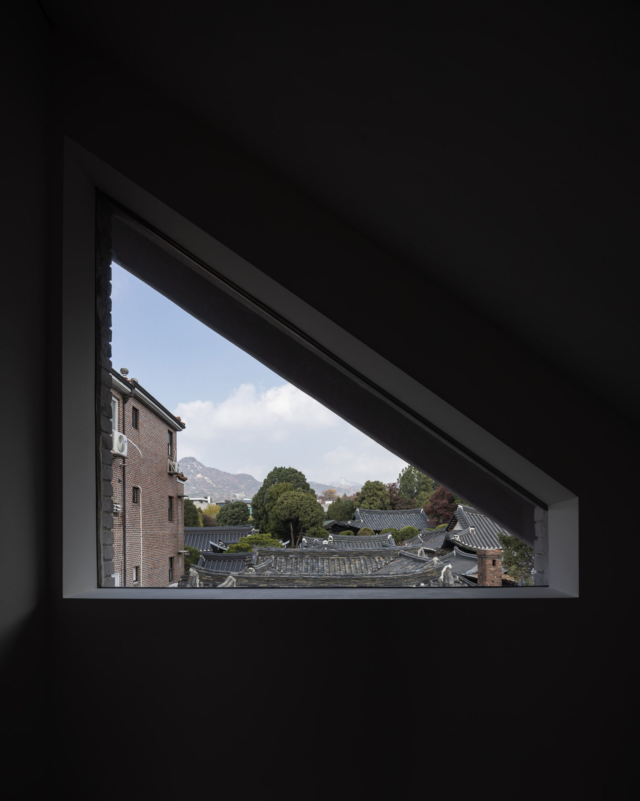
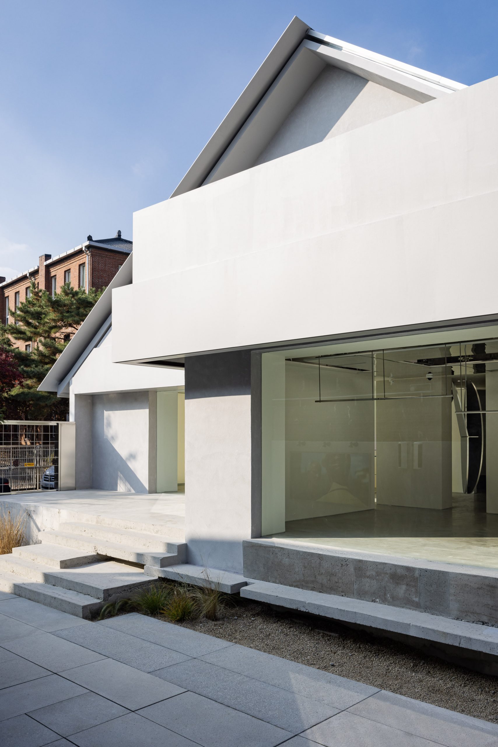
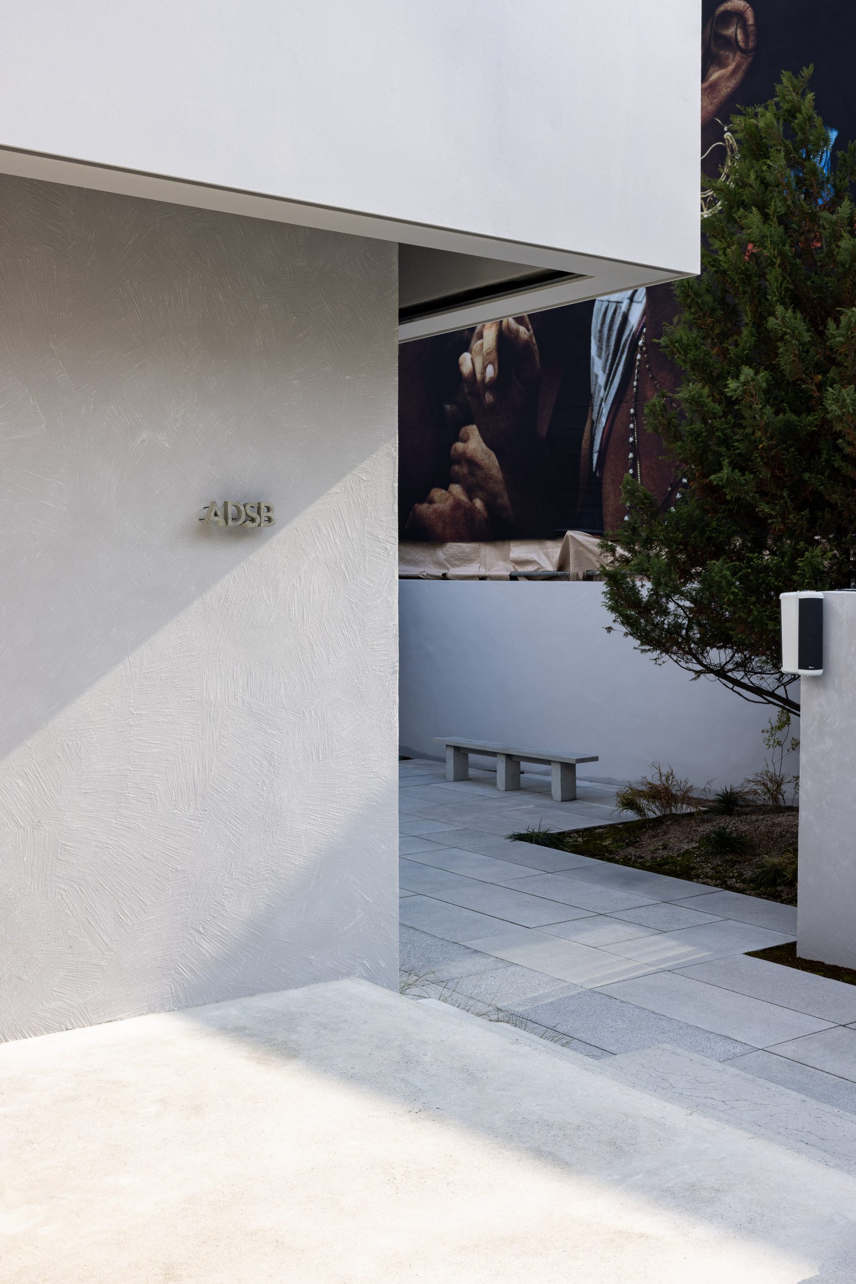
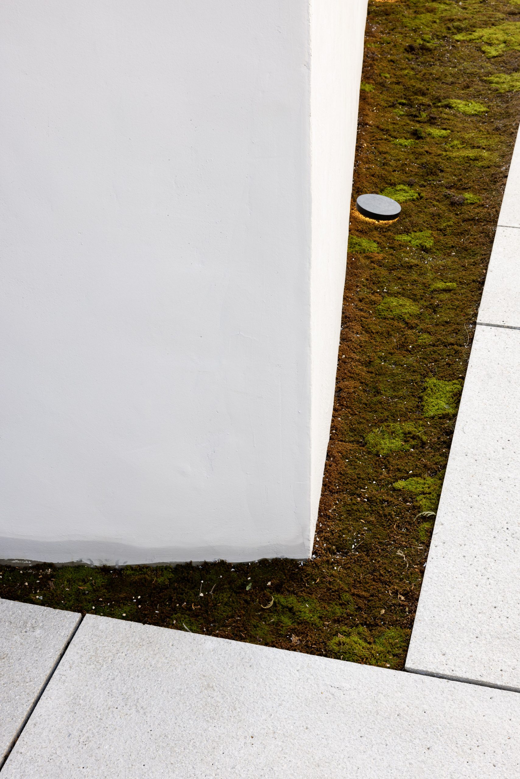
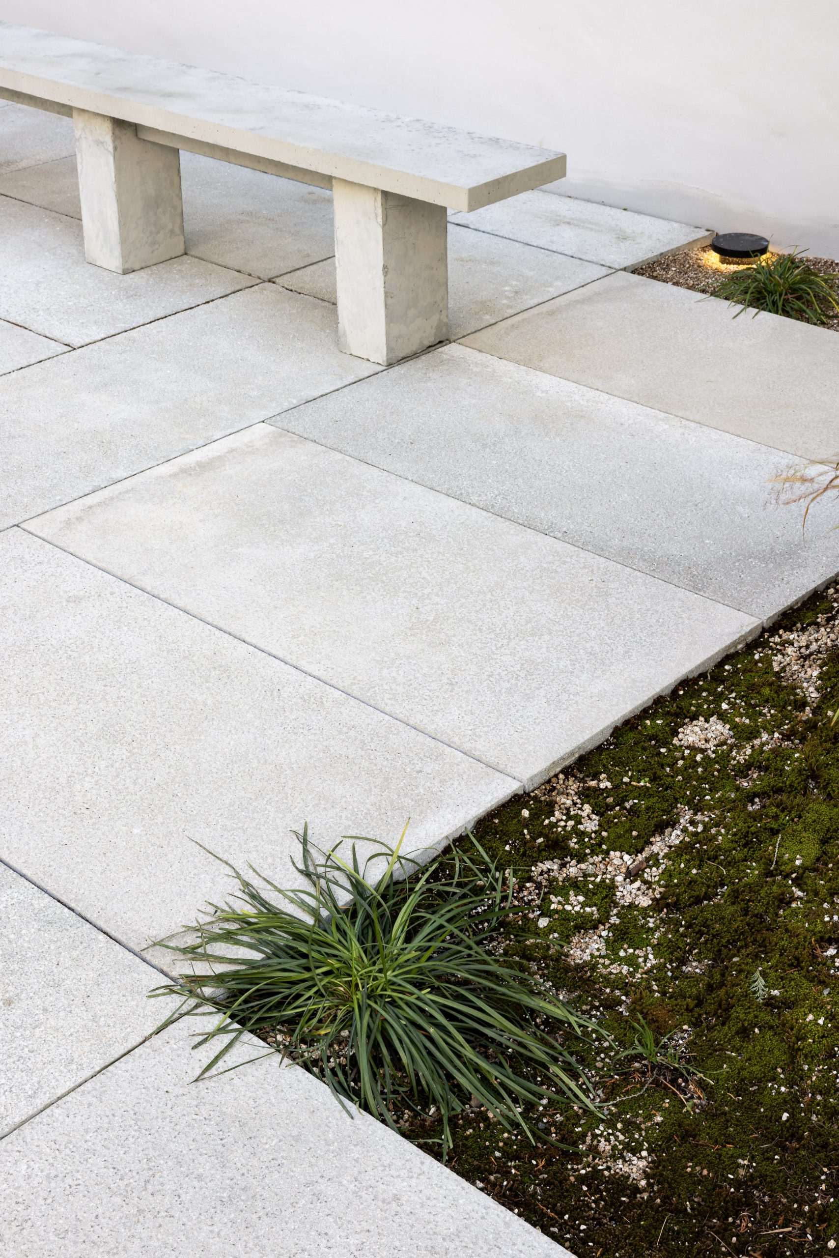
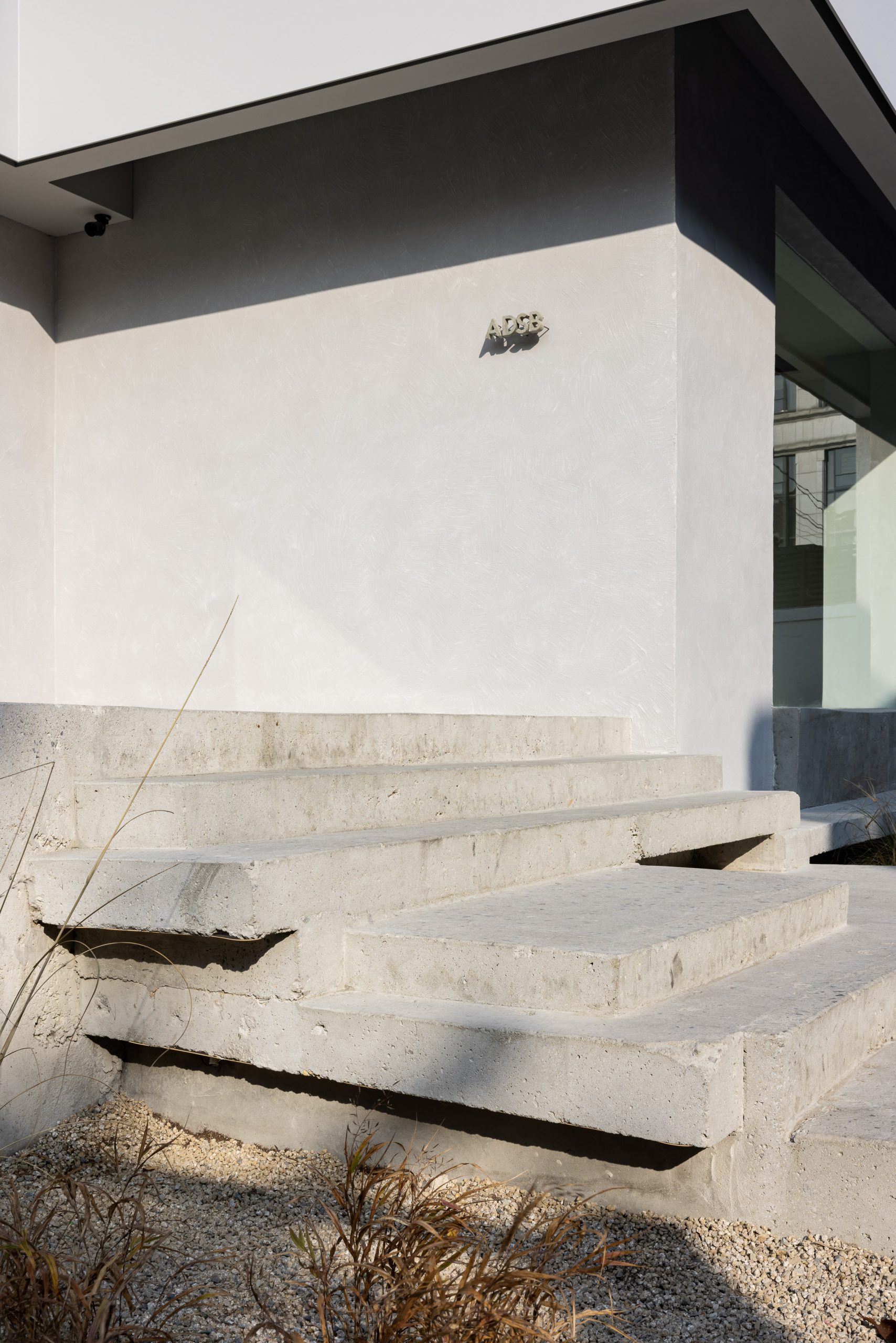
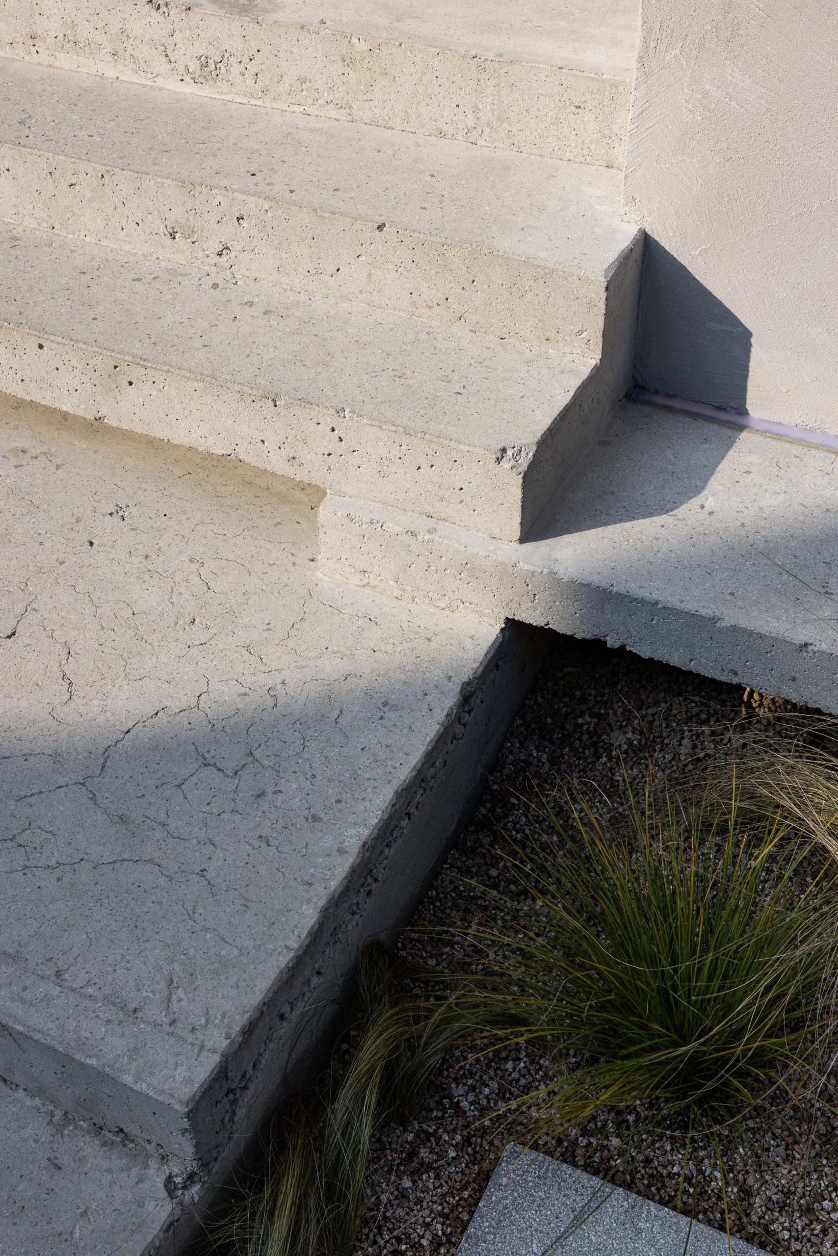
Existence, Sensory of Texture, Power of Sight
실재하는 것, 감각의 결, 이미지의 권력
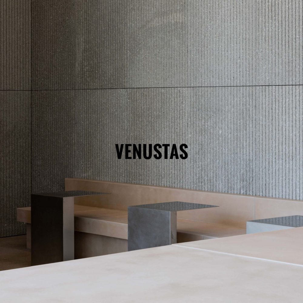
 

Business Scope

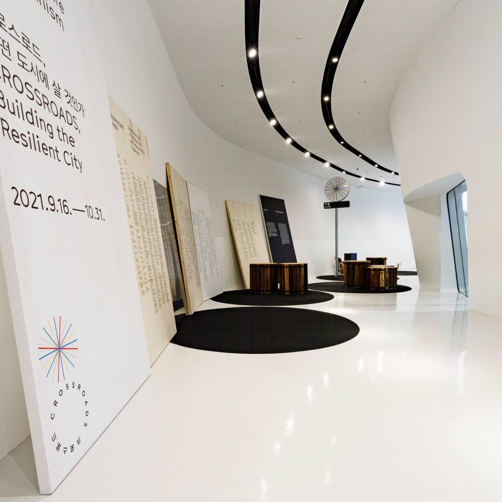
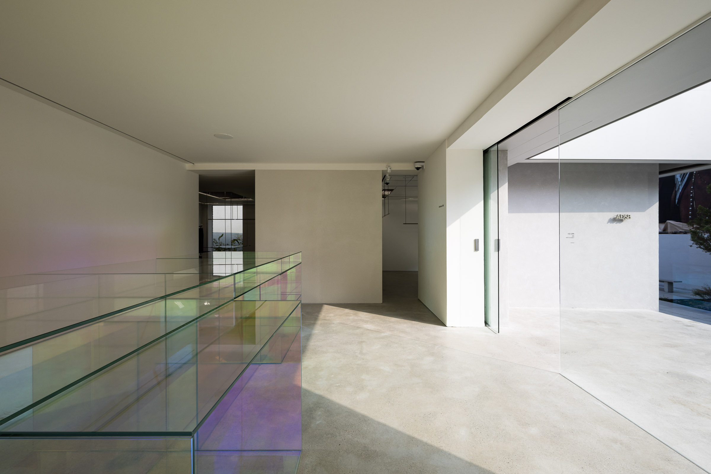
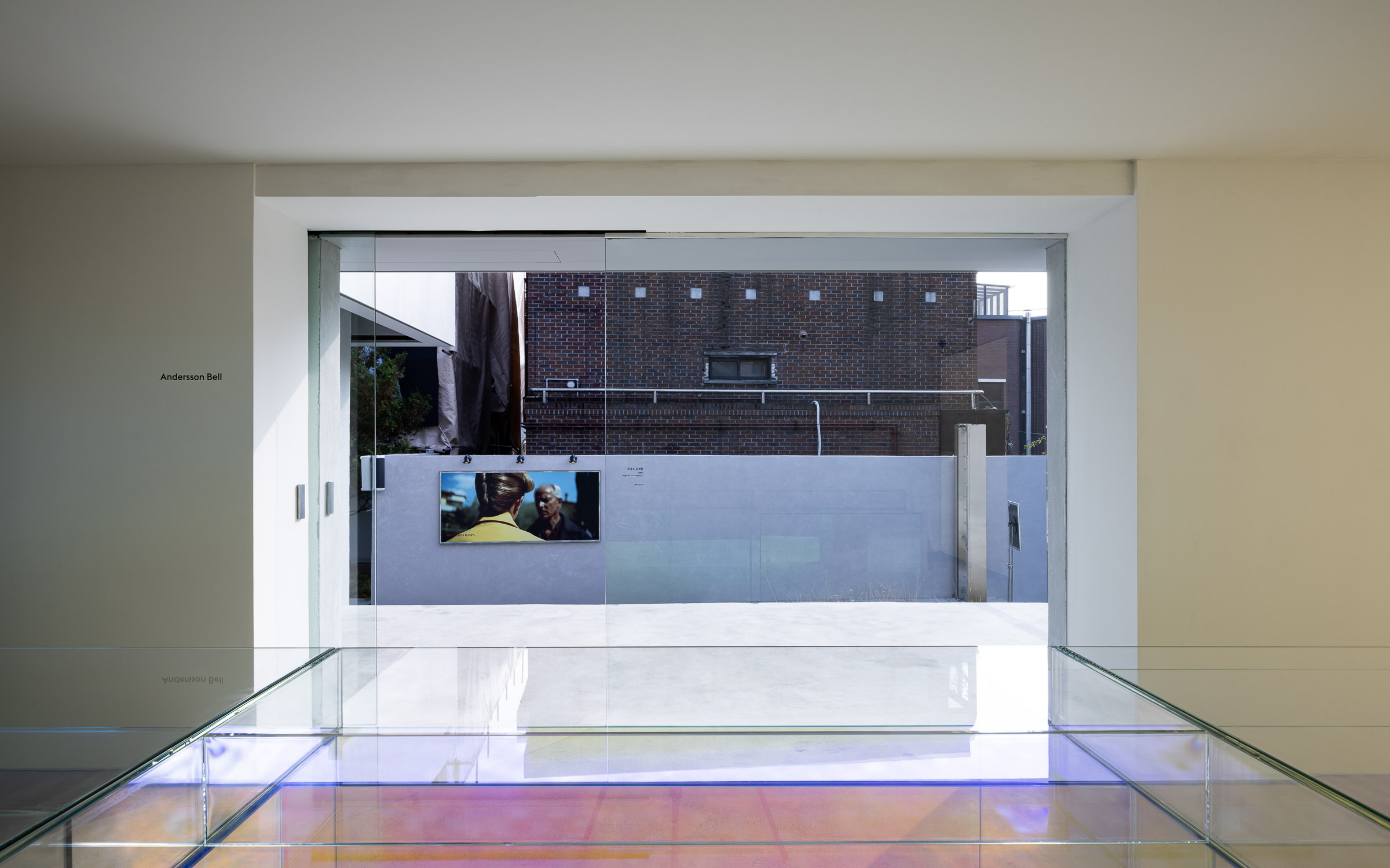
Architectural Design & Planning
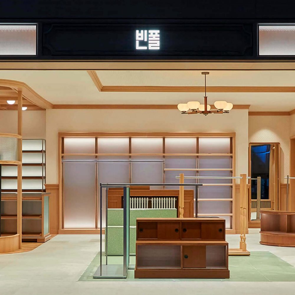
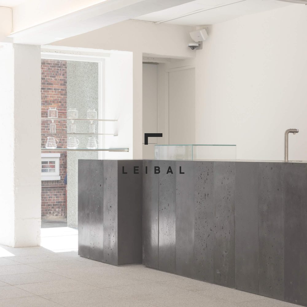
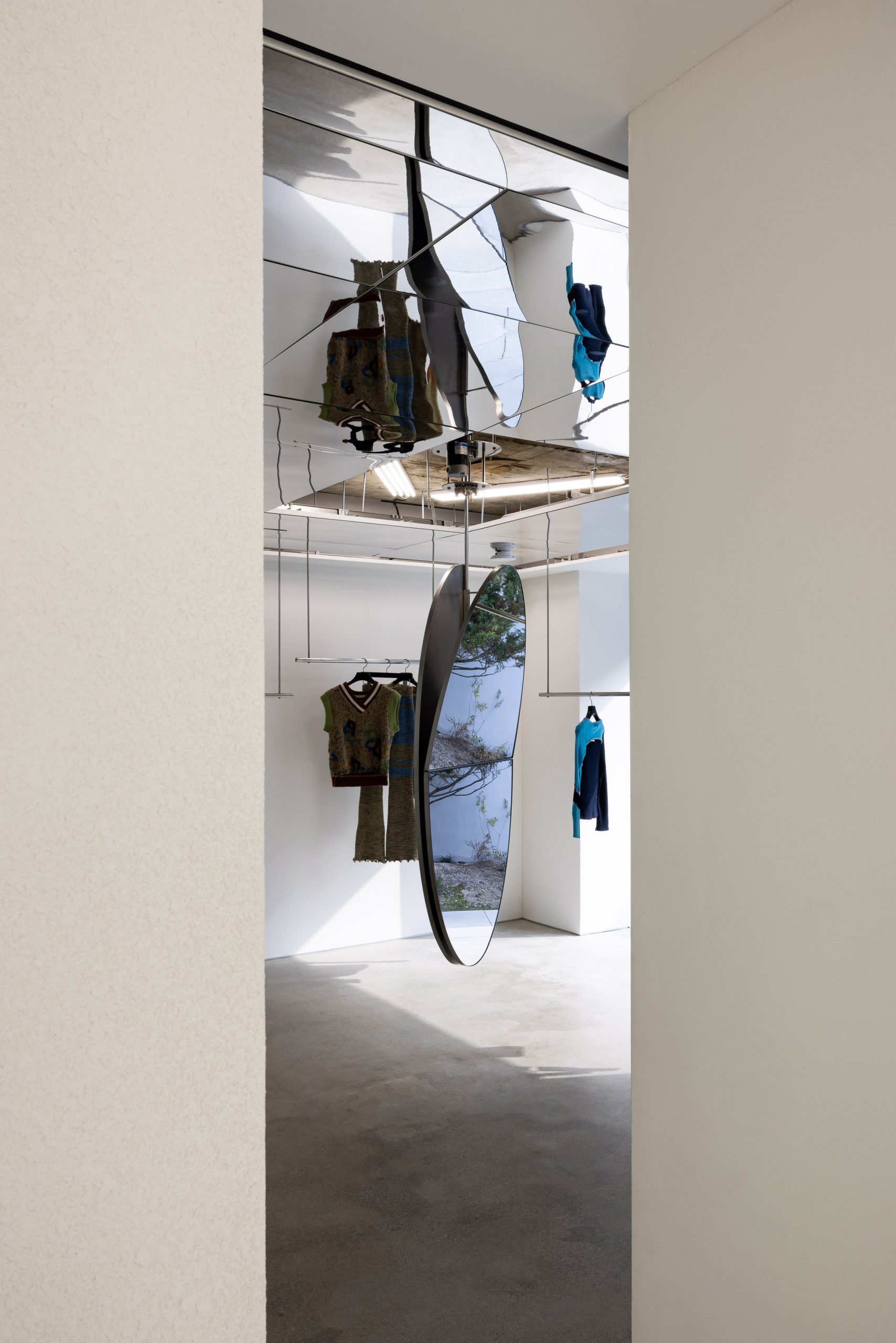
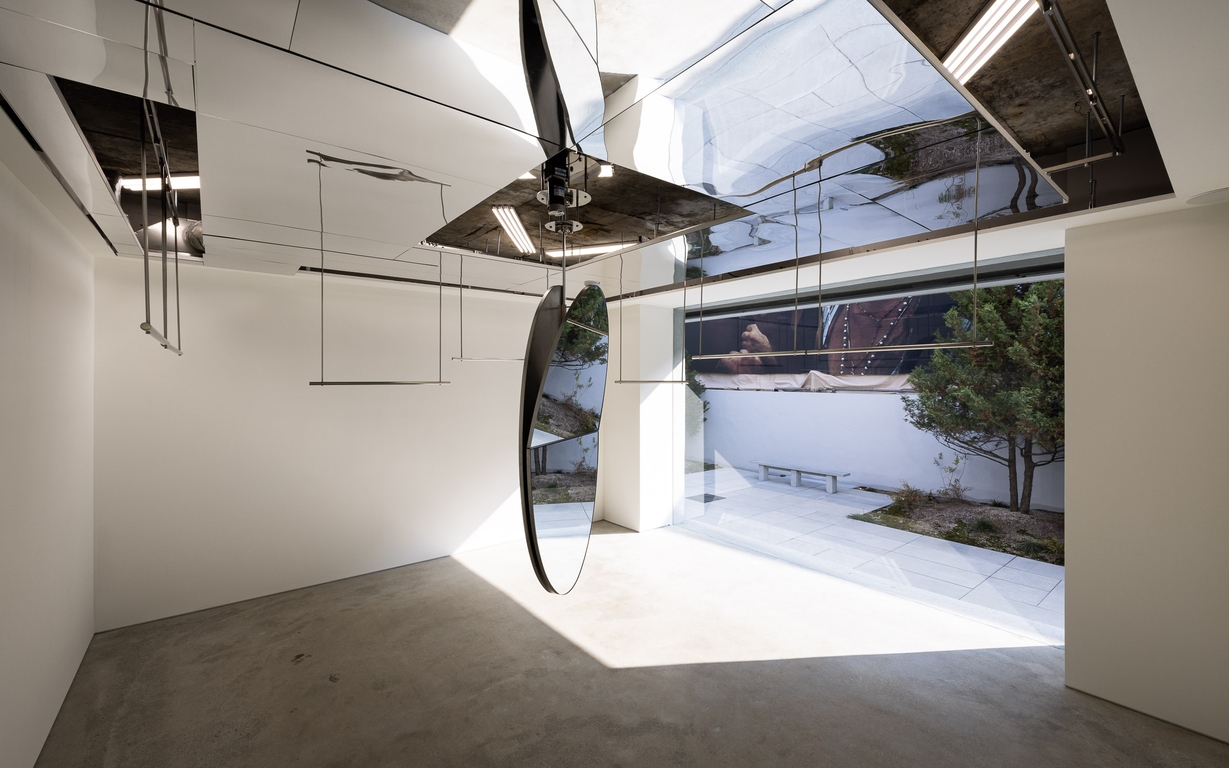
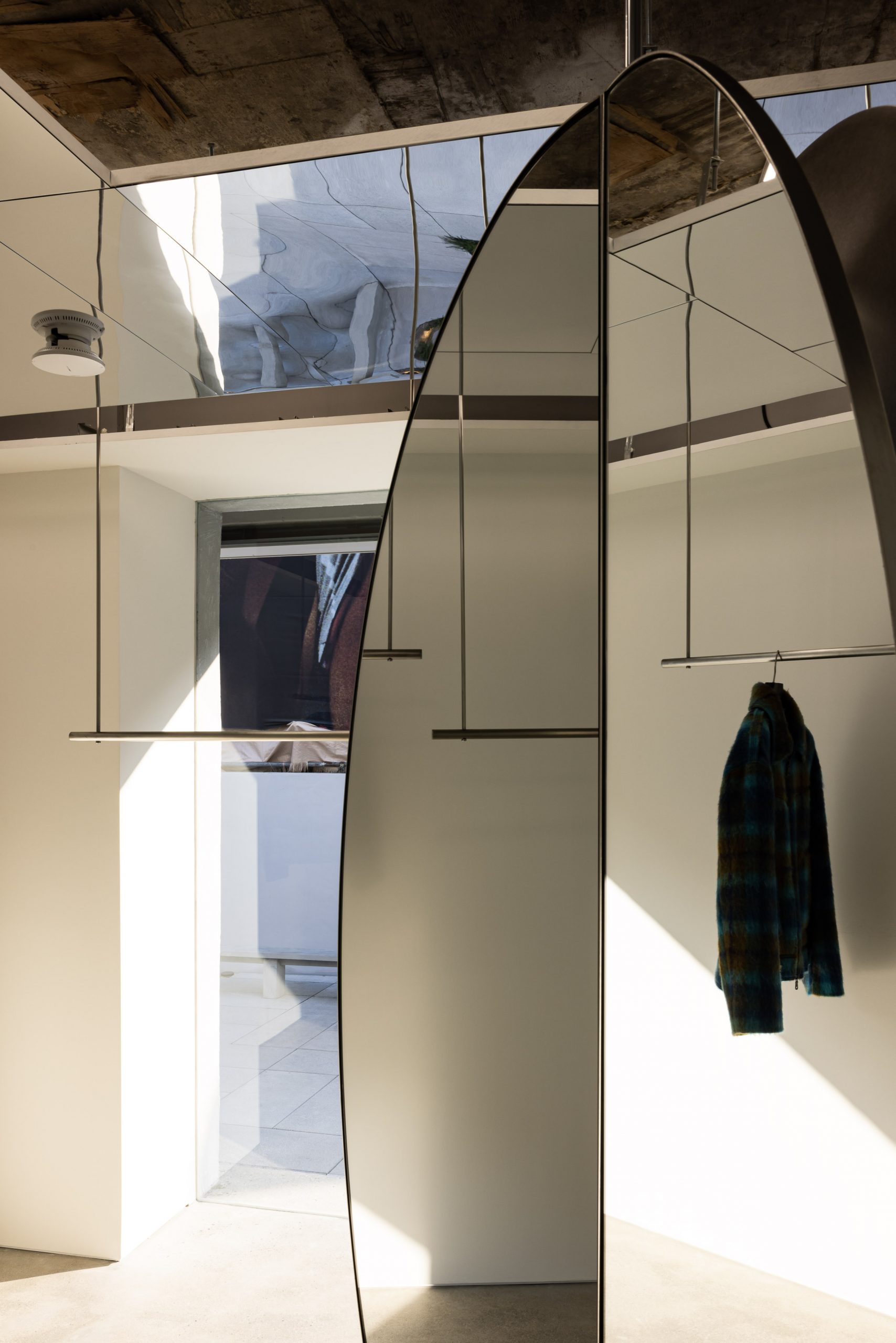
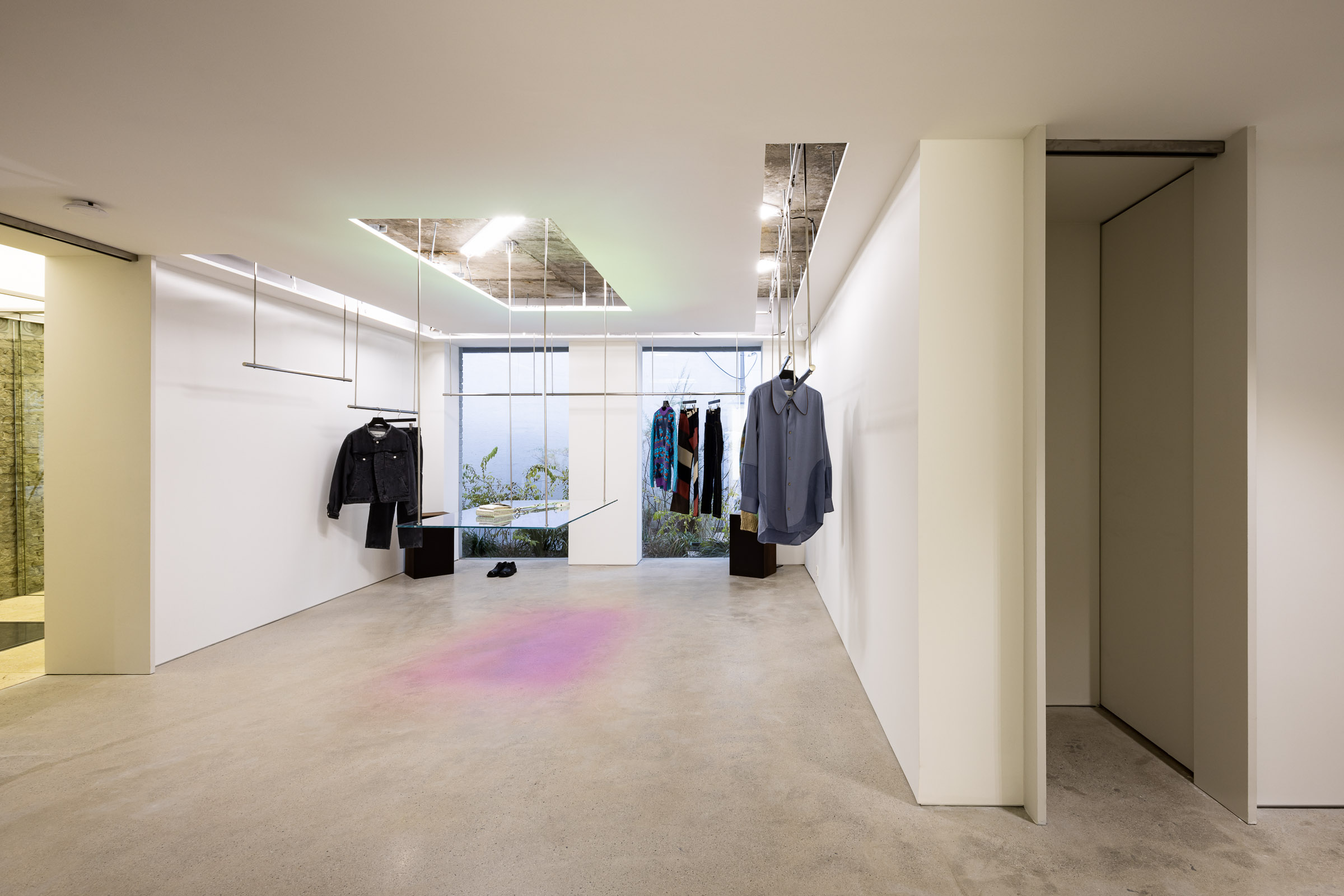
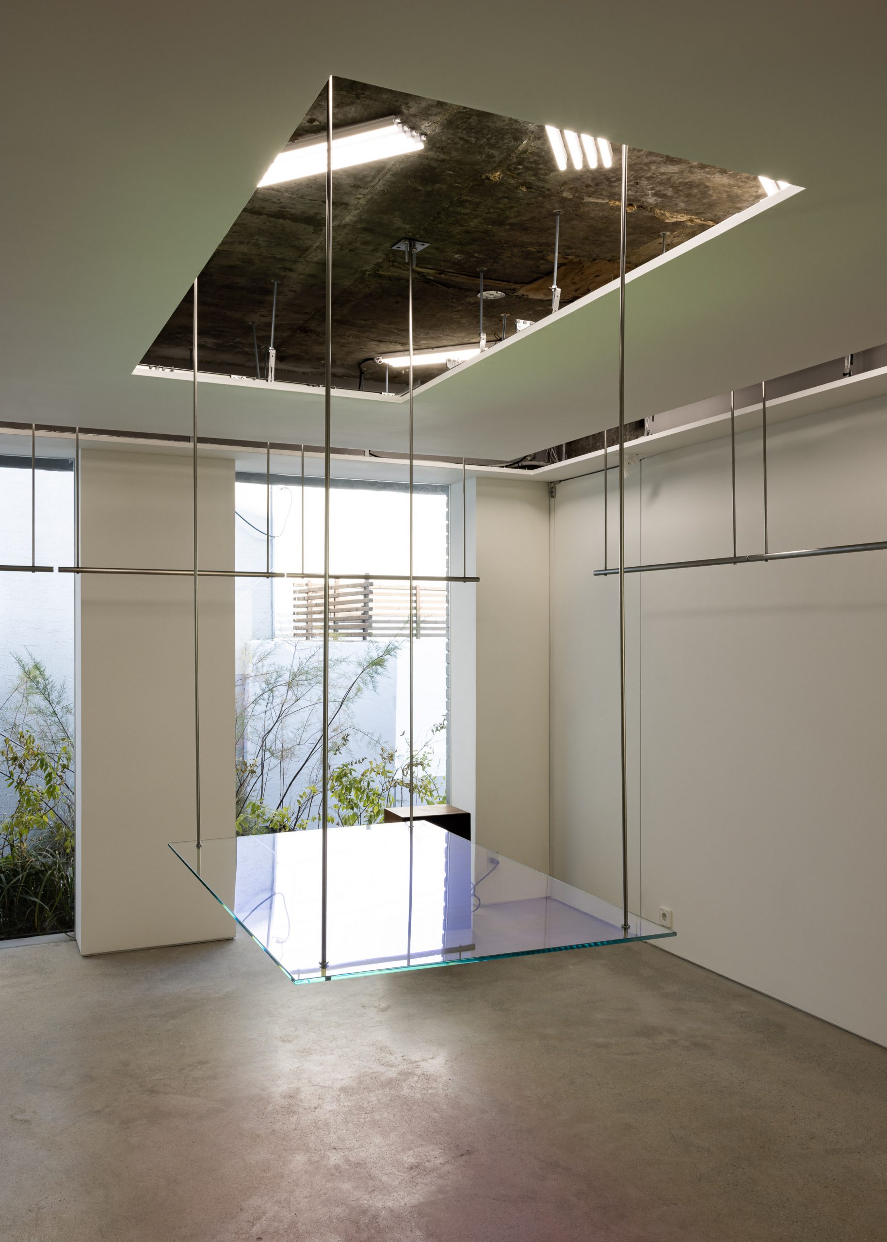
Interior Design, Planning & Construction
Design Planning & Consulting
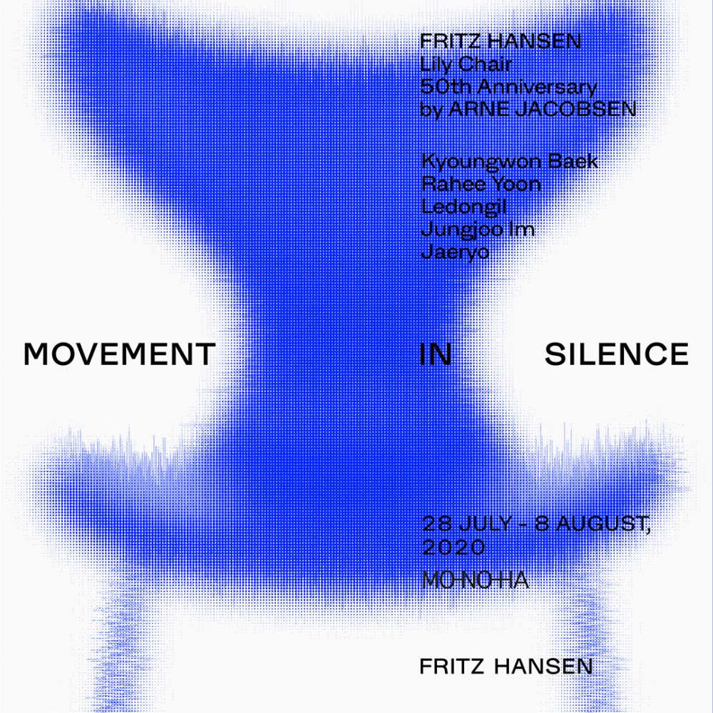
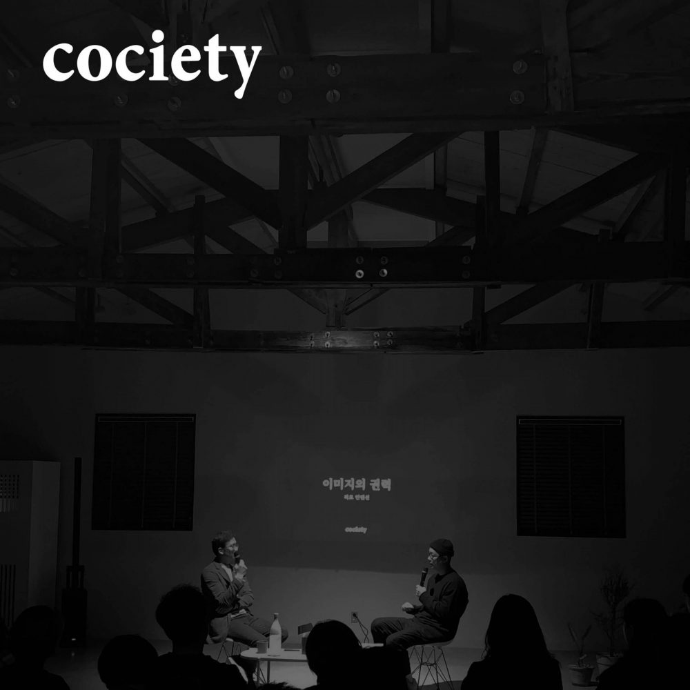
Brand Contents Planning & Consulting
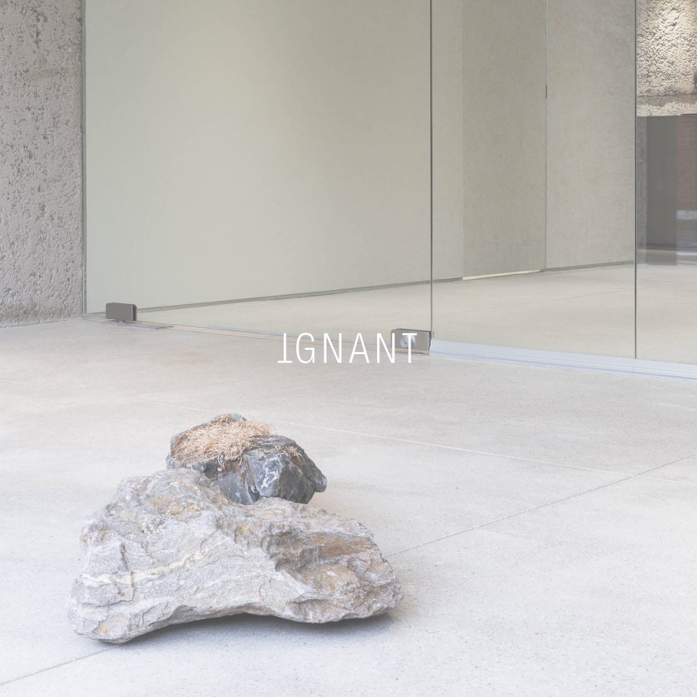
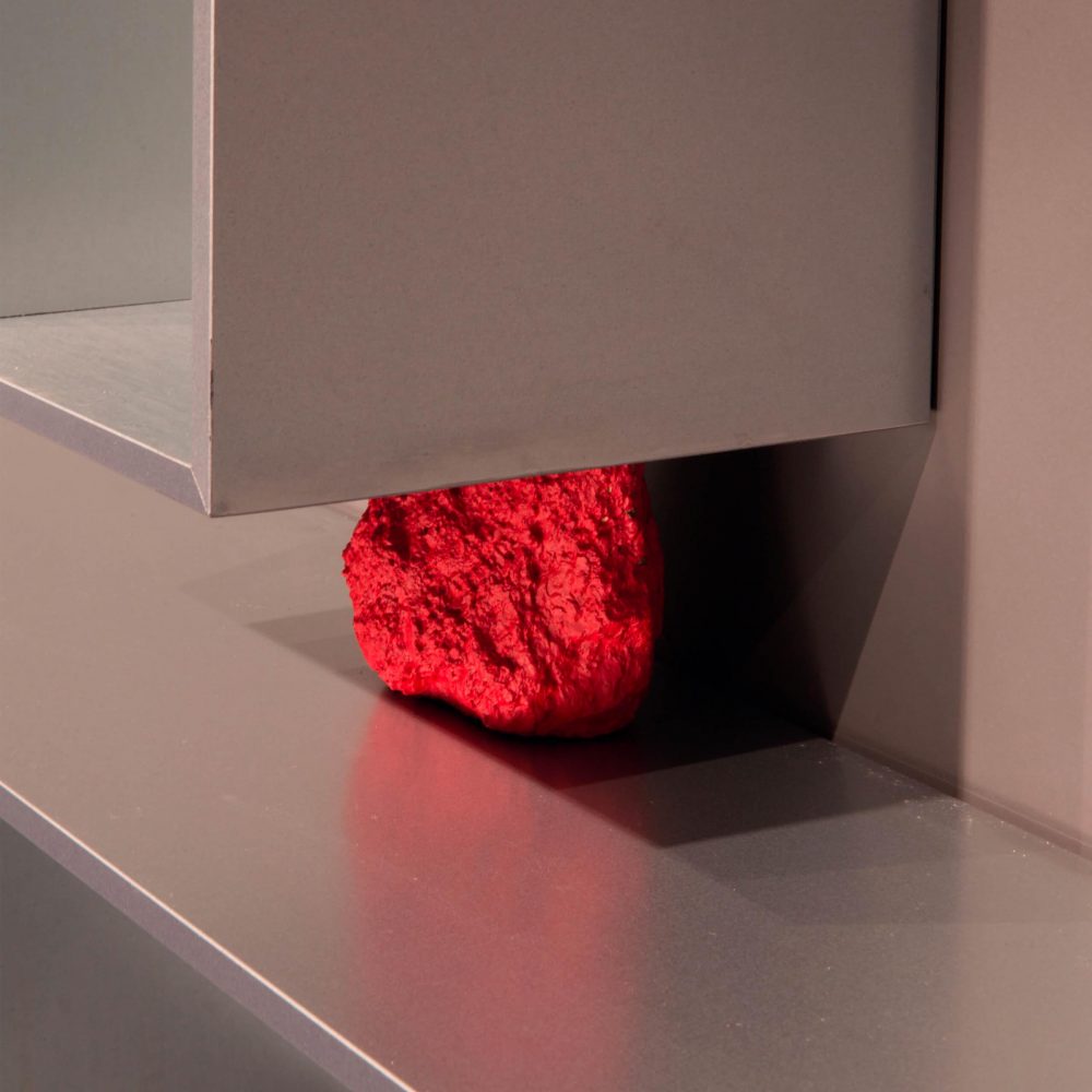
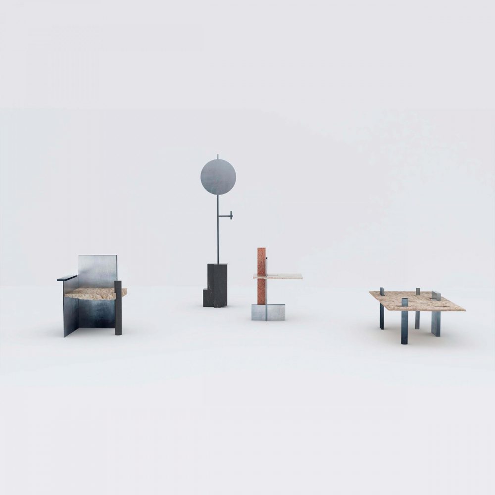
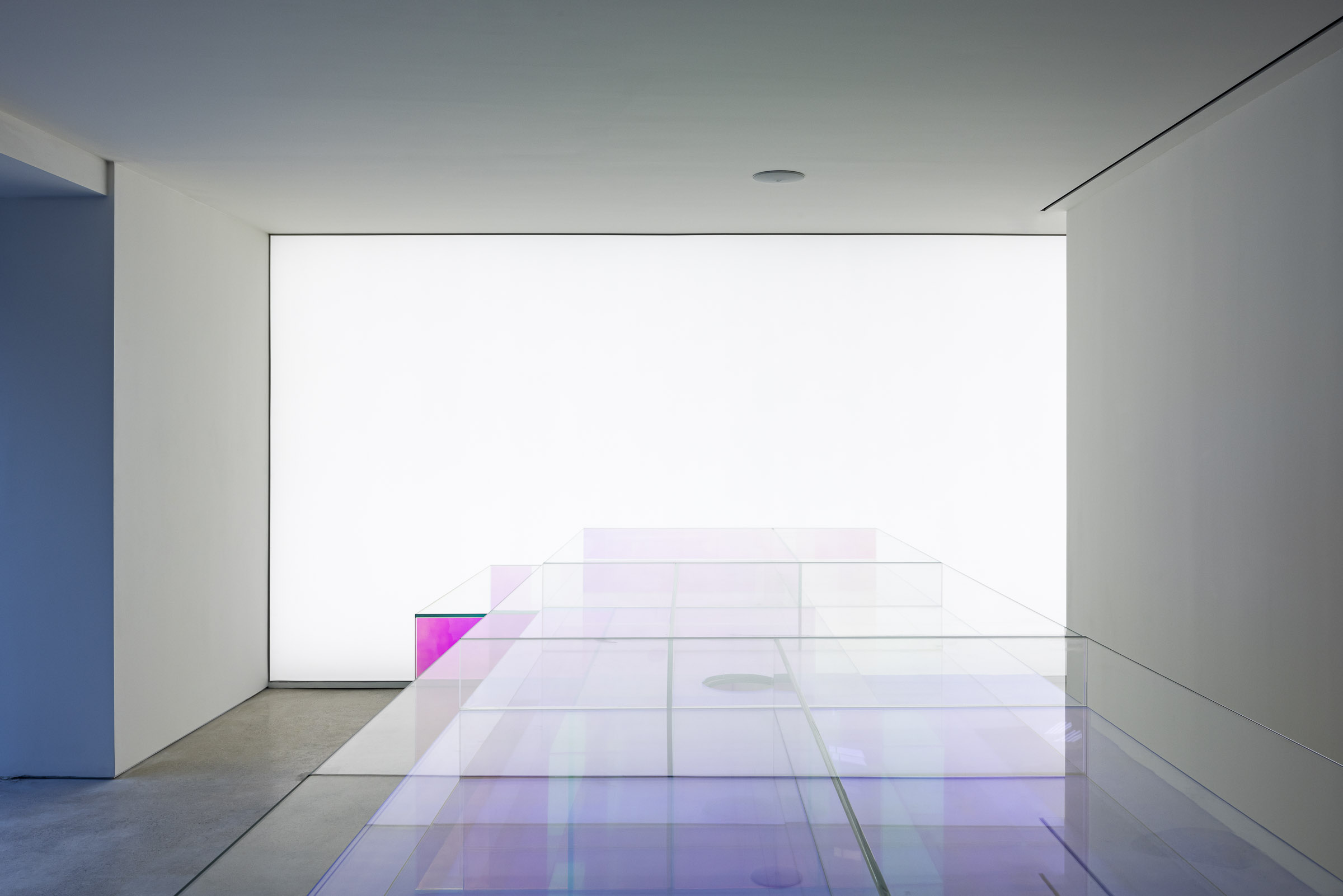
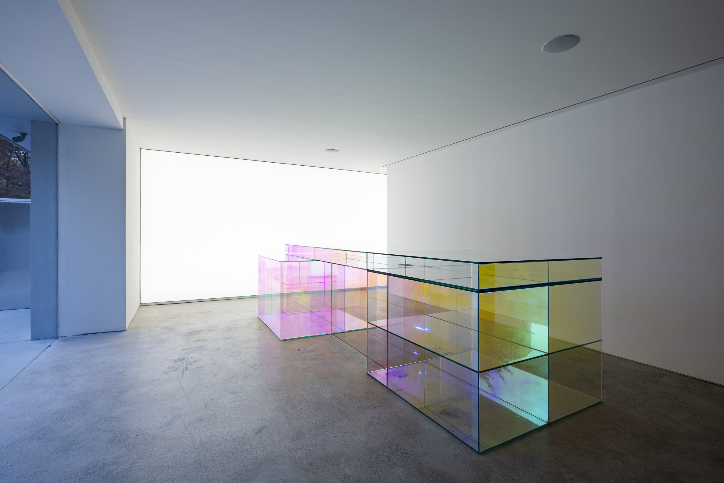
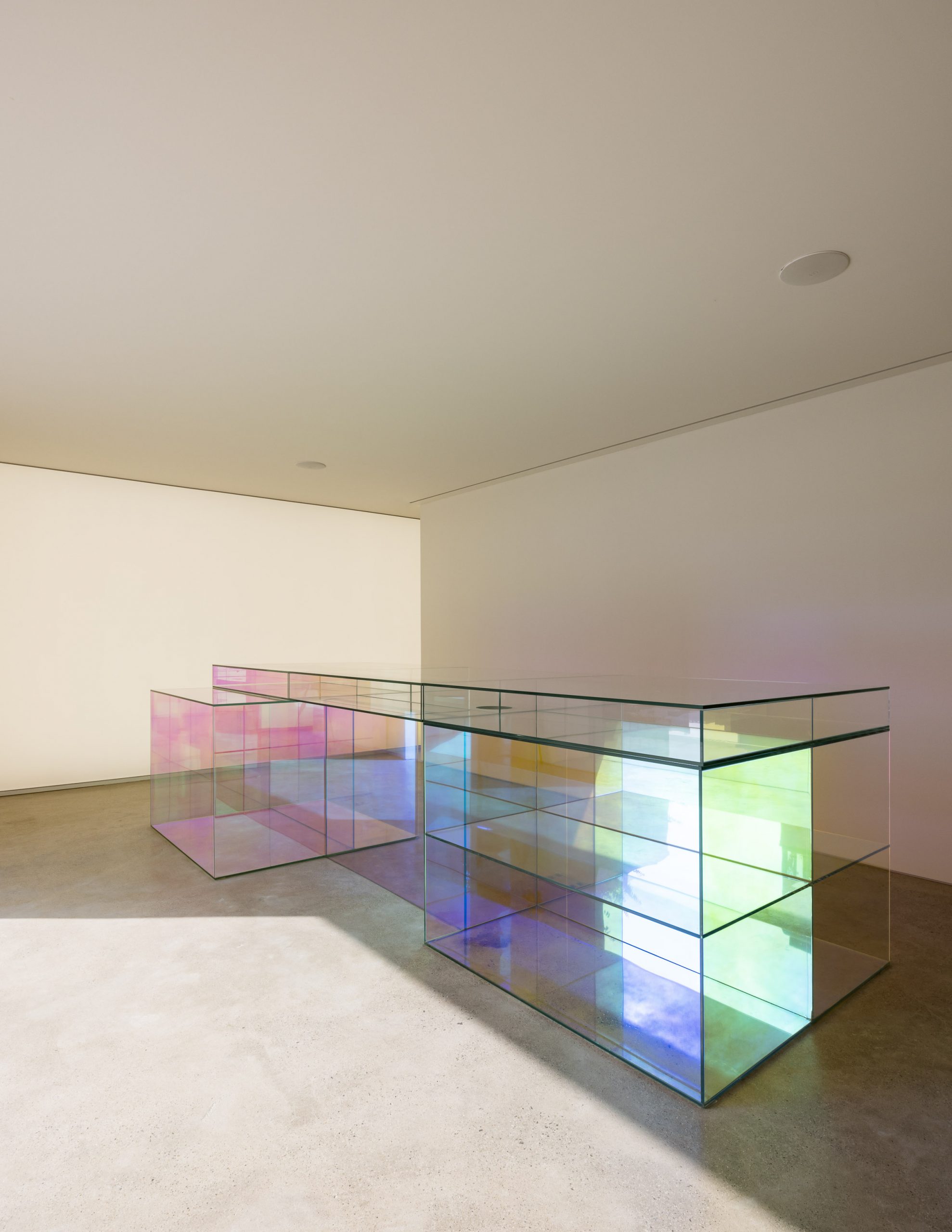
Art Direction & Installational Art directing
 

SEARCH


WORK


PRESS


Andersson Bell Gyeongbokgung Store

[과거의 집, 현재의 앤더슨 벨]
언젠가 시간이란 미래에서 우리를 향해 흘러오는 것이라 하던 브랜들리(Francis Herbert Bradley)의 글을 본 적이 있다.

이 건물을 처음 마주한 감정은 막막함, 그다음은 고통의 예상, 그리고 오랜 시간 싸워 고쳐야 할 낡은 주택이 재생될 어떤 모습. 어쩌면 환생 같은 단어도 생각해야 했을 것이다. 그만큼 수명이 다한 주택을 개조하여 스토어로 만드는 프로젝트는 다시 태어나게 하는 것과 같은 작업이다.


두 번째 앤더슨 벨 스토어를 만들 때도 여러 겹 겹친 과거의 마감재들이 상업 유적지를 연상케 했는데, 세 번째 스토어인 이곳은 전체를 덧붙이고 깎아내야 할 것 같이 방치된 미완성의 조각품 같았다. 이쯤 되면 오랜 시간이 만들어낸 흔적들을 보유한 공간이 앤더슨 벨을 설명할 귀중한 단서라는 생각도 든다.


이번 앤더슨 벨 스토어는 2가지의 키워드로 전체의 맥락을 풀어나갔다. 첫 번째는 ‘아플라(Aplat)’, 두 번째는 ‘투영’이다. 전체를 관통하는 어떤 메시지를 담으려고 외치는 것보다 자연스럽게 이 마을에 존재감이 서서히 드러날 수 있는 건물이 될 방안을 모색했다.


첫 번째는 방치된 조각에서 단서를 가져왔다. ‘아플라’라는 단어는 뼈대와 골격이란 뜻으로 조각이란 게 그 생성의 과정이 건축의 과정과 흡사하다고 볼 수 있다. 그런데 이미 만들어진 형태 안에서 작업하는 인테리어 디자이너의 한계는 늘 누군가 만들어 놓은 골격에서부터 시작된다. 이 골칫덩어리 골격을 처리할 방안을 프란시스 베이컨(Francis Bacon)에서 영감을 받게 되는데, 베이컨은 자신의 그림에서 단색의 배경이 골격이고 그려지는 사물이나 인물은 형상이라고 표현한다. 이 개념으로 우리도 하늘을 아플라로 생각하고 나니 골격 형상으로서 조각화될 수 있음과 동시에 새로 태어날 태초의 무색성이 부여된 앤더슨 벨의 세 번째 스토어가 자연스럽게 표현되었다.


두 번째는 내부에서 디자인 키워드로 정한 ‘투영’이다. 가장 기초적인 디자인을 풀어 갈 개념임과 동시에 쉬운 소재로 다르게 보이기의 관점을 전하고 싶었다. 어느 날 엉뚱하게 거울을 보다 거울은 대체 뭘까에 대한 스스로의 정의를 내리고 싶었던 적이 있었다. 대상을 투영하지만 스스로는 그 대상이 되지 못하는 거울의 존재가 마냥 신기했던 것이다. 대상을 투영시키는 도구. 또는 스스로는 무엇에도 종속되지 않는 이 실재의 평면. 거울이야말로 시간 그 자체를 시각화해주는 사물이라는 생각이 든 것이다. 흥미로운 이 재료는 곳곳에 투영될 실재를 왜곡하며 설치되어 있는데 당장의 시간이 과거로 흘러가기 전에 우리의 기억 속에 꼬집어 놓는 역할을 할 것만 같다.


Type: 패션 플래그쉽 스토어

Client: Andersson Bell
Location: 서울 종로구 윤보선길 42
Floor Area: 120㎡(36.3PY)
Involvement: 컨셉 디자인, 시공
Date of completion: 2022년 11월
Photography: 한성훈


Once I read Francis Herbert Bradley’s text saying ‘a time’ is no other than a thing which comes toward us from future.

First sentiment arisen when I faced this building was the feeling of backbreaking or murky, then, I could dimly grasp any pains to come, and imagined the future image of this old and worn house, if regenerated after quite long period of struggles to fix it. Maybe I also had to remind a word such as ‘rebirth’. A project to convert such house in the last minute of its lifespan to shop building, is as almost same as making it reborn.

Also, when I took charge of a project to make the 2nd Andersson Bell store, that existing finishing materials piling many folds in the building brought up the image of a relics-like building which could be, hopefully, used commercially later only after renovation, and this place, 3rd store, seemed like an abandoned and incomplete sculpture needed a whole scale of renovation, adding or cutting. As of the time, I couldn’t help but to think that perhaps, these old places maintaining their history and traces for a long time, could be invaluable clues to explain the philosophy of Andersson Bell.

I prepared two keywords to renovate this Andersson Bell store. First one was ‘aplat’, and second one is ‘projection’. I preferred to make it to be gradually and naturally recognized by people after renovation, rather than provoking people with some artificial message penetrating the whole characteristic of the building.

First, I earned an inspiration from an abandoned fragment or a piece as a part of those materials. The word, ‘aplat’ means ‘frame’ or ‘framework’, and I think the process of producing a fragment resembles the process of architecture. Meanwhile, the systemic restriction of interior designer, come from its mechanism, is that we have always to design their interior from a framework already built by someone. As for me, I was drawn by Francis Bacon’s thoughts to resolve the headache or nuisance for me, in other words, this framework, because Bacon expresses a monotone background as a framework, and an object, figure or people in picture as a shape or form. By using this concept, once we thought ‘a sky’ as an aplat, we at least could add our sculptures on this frame as well as, at last, reinterpret and present the concept of ‘primitive colorlessness’ in the third store of Andersson Bell.

Second keyword was ‘projection’ mostly used for its ‘interior design.’ Our project was based on it, as the most basic concept, and at the same time, we tried to reinterpret easy, common, and generally used materials to be projected from different perspective. One day, when looking a mirror, one whimsical idea of ‘what is mirror?’ came to my mind, and I tried to define it myself. I had much wonder about the existence of mirror, which can project an object, but it all the more can’t be an objective by itself. It could be a tool to project an object. Or a plane of existence which doesn’t belong to anything by itself. I thought it would be only the mirror in places for them to project some existences by distorting it, to play a role to clip some frames of our time into our minds, before they already belong to the past.


Type: Fashion Flagship Store

Client: Andersson Bell
Location: 42, Yunboseon-gil, Jongno-gu, Seoul, Republic of Korea
Floor Area: 120㎡
Involvement: Concept Design, Construction
Date of completion: Nov. 2022
Photography: Sunghoon, Han